Visingsö Tornerspel
Jokkmokken | Fri, 09/15/2017 - 10:28
Brief from client
A logo for a association that once a year arranges a family oriented event with jousting and other activities in a medieval times atmosphere.
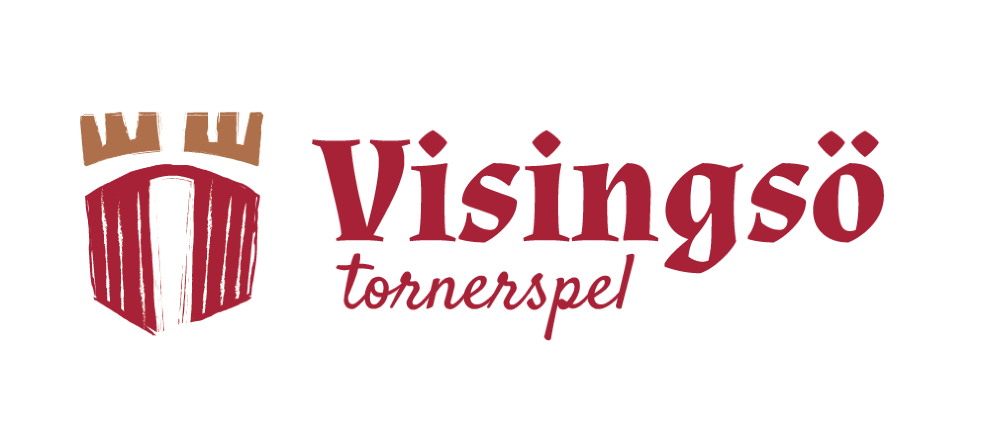
Wanted a bit of a rough feeling for this. There are improvements to be done but how about the concept?
Is the font choices to "medieval" oriented, perhaps it should be more modern? The main and subtext are both quite unique and perhaps used together a bit overwhelming?
4 Comments
Symbol on top
I definitely think having two very stylized fonts together doesn't blend all that well. The top font is a bit underwhelming to me. I would also consider including the brown somewhere else in the logo, such as in the sub text. Give this piece some more contrast.
As far as the concept, I think the hand drawn feeling is great. However, it needs to be pushed much further than it currently is.
Yep, got it.
http://www.myfonts.com/fonts/kostic/taurunum/
You could possibly consider a font like this, if you're looking for a design savvy alternative to medieval styled typography.