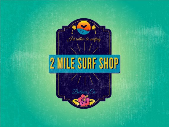
What do you think about it?
Brief from client
Looking for new logo design for a surf shop in Bolinas in Northern California. Interested in designs for kids and women. We are located in a small funky artist community. The name of the shop comes from the story of the townspeople taking down the road sign that said Bolinas 2 miles with an arrow. They stopped putting the signs up years ago, there is no sign that says Bolinas or how to get there. Well, with modern times you just google or gps and get to Bolinas. We are a colder climate beach. You can wear bathing suits here, however when you surf you west a 3/2 wetsuit and most often booties. Bolinas has a nice wave and is a great beach for beginners and women. I would say we have just as many female customers as males. Our customers range in age from 7 to 80 years old. Yes, we have women surfing well into their 70's (awesome). Looking for something for our female customer. Our women are friendly, strong, kind and inspirational. Please check out our website www.2milesurf.com
We also have a crystal surf report. You can also google Bolinas and get some ideas about the area. We did recently update our logo and created a new round one too. In the new round we have many color options. This can be seen on our instagram.


2 Comments
You are thinking way to complicated. I am curious to see what sketches you made before you started with this logo. If you check their website you can see how simplistic they made their logo before.
- To me this logo looks more like a plate for tapas.
- Nothing in this logo shows me it's about surfing.
Tip: Keep it simple. if you need so many colors there is no way your logo will succeed!
I would try a cool typekit with a nice wave or something.
Keep it simple and REAL!
Unfortunately, this is doesn't really qualify as a logo. As Boghir aptly pointed out, this is way too complicated, you tried to cram way too many elements in it. And some of them definitely look like clip arts (the flower, palm trees, possibly the whale)
The composition is also all out of whack. The top and bottom part are super busy while the area around the word mark is pretty much empty.
I can sense a real eye for design behind this logo but you need to simplify the whole thing drastically!
Keep it up!