0-0republik
kaosme | Mon, 01/30/2012 - 20:02
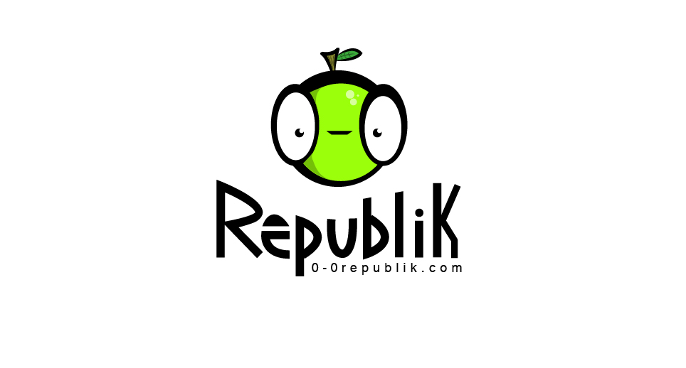
Brief from client
The client wants a logo that looks both playful and serious. It will mostly be used on white or light colored background.
Alright. I went with another idea because the sight also mashes up with characters.
11 Comments
Ta melhorando amigão!
Way better that previous versions.
The apple looks like a grasshopper. I would make it look entirely like a grasshopper.
I would like to make it as a grasshopper but i just don't see the shape it could take. Each with their artistic view. :) Thanks for the feedback.
Replace the stem and leaf with a couple of little antennas. That's all you need.
ohh... so that's what you meant.. i was thinking like add a body and i didn't see his pose. I will try that to see how it looks.
Exactly. I wasn't talking about the ENTIRE grasshopper :)
LMAO, this is hilarious and I like it:)
I like this too.
With a couple of issues:
-The tag line is really small.
-The tag also needs to be aligned at the end or go further. It's too close now, so it looks like a mistake.
-Using just the symbol- it doesn't read "OO Republik" It requires the tagline.. but that shouldn't be a huge issue.
All in all- I like it and think it works for the client. Good job.
You are right about tagline, I failed to notice it completely while I was laughing at the icon.
Good work!
the icon is serious but it looks like funny because of the stem nice try.the entire whole concept is good,i like it.