Brands of the World is the largest free library of downloadable vector logos, and a logo critique community. Search and download vector logos in AI, EPS, PDF, SVG, and CDR formats. If you have a logo that is not yet present in the library, we urge you to upload it. Thank you for your participation.
24seven
freshfabs | Sun, 12/02/2012 - 18:27
Brief from client
twenty4seven is all about
the hardship we pass through
during the day
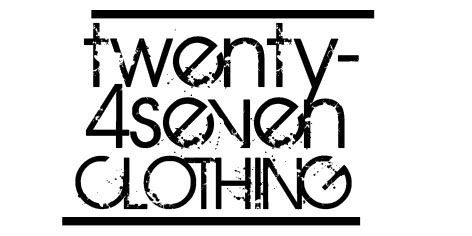
This font is too distorted, very difficult to read. Yeah, it has a mdern look and feel, I can see what you wanted but I would not sacrifise readability like this. Besides I'm missing some order and some ballance in here, the two sides of the text block are not well aligned. The text should be forming a perfect rectangle but it isn't. The two thick lines make no sense to me and since they aren't aligned either, they are breaking the composition too.
Never use a destructured font you found on DaFont for a logo. What you will find there is ok for a 15th birthday invitation card, but certainly not for a logo. This here font has too many details and is almost a logo in itself. It will be also a bitch to reduce, flock or turn into a embroidery (since it's a clothing line)
Oscar and shawali are 100% correct. I had a client that insisted on this type once (birth of a hero) and it was just as inappropriate then as it is now. Try creating a symbol instead of just type.
7 Comments
This font is too distorted, very difficult to read. Yeah, it has a mdern look and feel, I can see what you wanted but I would not sacrifise readability like this. Besides I'm missing some order and some ballance in here, the two sides of the text block are not well aligned. The text should be forming a perfect rectangle but it isn't. The two thick lines make no sense to me and since they aren't aligned either, they are breaking the composition too.
I totally concur with Oscar.
It is barely readable.
Never use a destructured font you found on DaFont for a logo. What you will find there is ok for a 15th birthday invitation card, but certainly not for a logo. This here font has too many details and is almost a logo in itself. It will be also a bitch to reduce, flock or turn into a embroidery (since it's a clothing line)
Oscar and shawali are 100% correct. I had a client that insisted on this type once (birth of a hero) and it was just as inappropriate then as it is now. Try creating a symbol instead of just type.
And I will add my two cents in the form of: What everyone else said! (Extra points to Shawali about the 15th bday invite- spot on!) :)
Ditto!
bad!
Not intuitive about the brand, bad typo choice and the effects are awful.