Brands of the World is the largest free library of downloadable vector logos, and a logo critique community. Search and download vector logos in AI, EPS, PDF, SVG, and CDR formats. If you have a logo that is not yet present in the library, we urge you to upload it. Thank you for your participation.
Version history
Version 1

- I
- S
- T
- C


6 Comments
I think this is a great starting point, but there are two things I'd switch up if it were me:
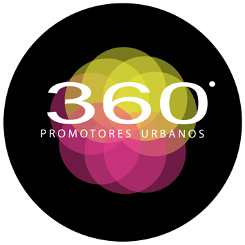
1.) Maybe make the black circle smaller so that there's a thinner frame around all of the color- right now the black kind of overwhelms everything else and I think it'd look more polished/interesting if the black border was at least 50% thinner!?
2.) I'm not loving the font used for '360'. The subtext looks good- maybe kern it in just a bit though- so it doesn't go as much into the black? But the 360 seems like it should be taller/fatter and again, not go into the black as much!!
Just some ideas! But I love love love the colors you chose for the middle- they really pop!
I agree with saraqroxy number 2 point. And i like the size of the black circle... but something is bother me... something is giving me the feeling of unbalance and I dont know what...
maybe the text not being exactly centered in the black circle? it looks a bit high
hmmm... maybe
You should think in other typography, and why don't you try without the black circle?
I also think you should try without the black circle