3br = express yourself
seratm | Mon, 11/12/2012 - 15:47
Brief from client
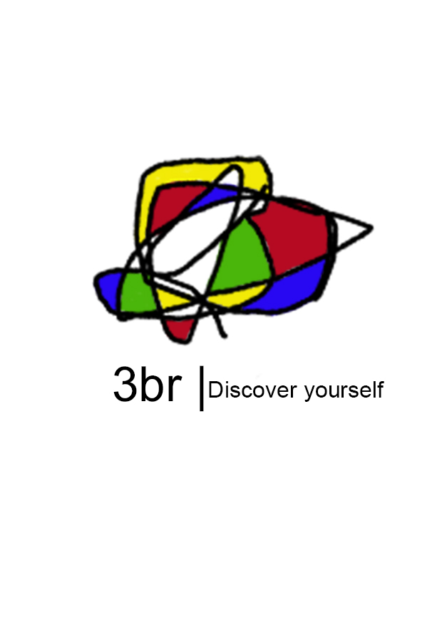
this is a logo for team in our college 3br means express i typed the word in Arabic also i make it as a shape of human with powerful view
this is may be my first work in logo i really need you critique as strong as it is i will learn from it
8 Comments
Sorry to be harsh, but this literally looks like a four year old's scribble tossed on top of some boring text. The dividing line isn't even centered...
I'm all for abstract logos, but this isn't a clean image, it iwasn't nicely imported, it isn't aesthetically pleasing at ALL. Simply put- it looks like it took all of 2 minutes to throw together and that's never a good look for a logo.
The font also leaves much to be desired.
Take a step back, sit down and sketch out some ideas and come up with something that actually has some thought to it.
i just think of making a logo as sort of doodle because when we think we start doodling maybe yes it's the first sketch but i have a real concept in this
yeah, there is absolutely no form or design in this.
It's not because you decided the symbol would be a doodle that you just got to put a random doodle up there. Actually, it's quiet the opposite. You would have to spend hours trying to find the right shape that indeed looks like a kid fooling around but also looks balanced and visually pleasing.
Charlie! (Can I call you Charlie?) I really want to know what you think of the "Lingle" logo- I think it's still on the first page! I love it, but I feel bad about loving it for some reason. If you have a moment give it a look!?!?!
Please, do call me Charlie =)
Microsoft Paint I presume! :3
You guys all fell for the bait again! This isn't a serious submission.