Brands of the World is the largest free library of downloadable vector logos, and a logo critique community. Search and download vector logos in AI, EPS, PDF, SVG, and CDR formats. If you have a logo that is not yet present in the library, we urge you to upload it. Thank you for your participation.
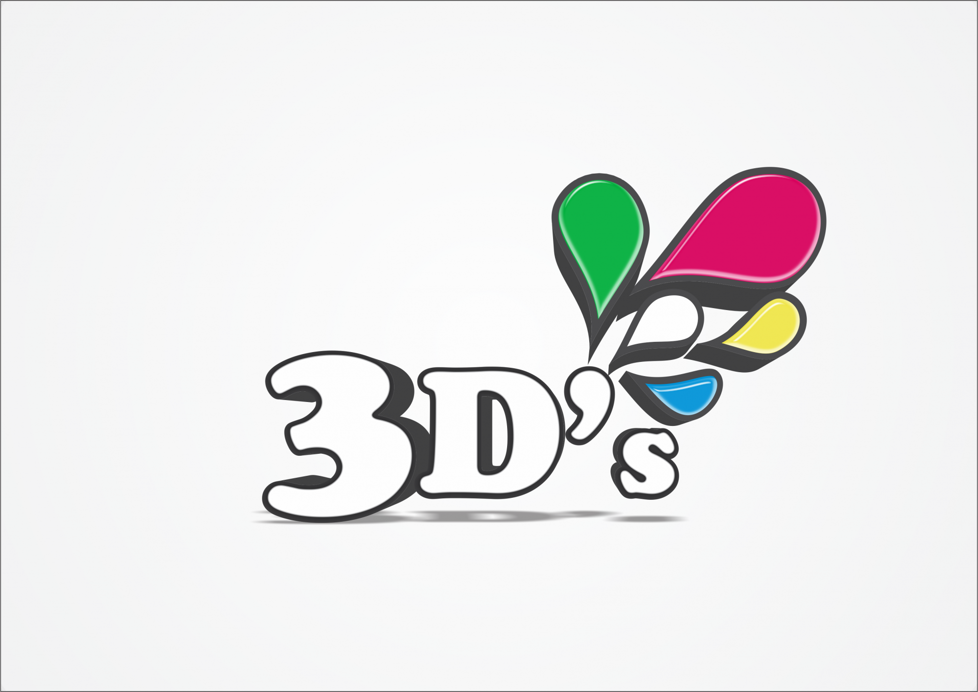
I think the drops are wrong. try making the top 2 (green) (red) the same size as the bottom 3. You will find it will look a lot easier on the eye. also space the letters better, this will make it cleaner...
IF THIS WAS MY LOGO I WOULD MAKE THE WHITE DROP THE APOSTROPHE AND THE OTHER DROPS FLOW WITH IT...
I agree with the previous comment about the apostrophe. Get rid of the shadow or soften it up a lot, it's distracting at the moment. I don't know what the 3D's are but I'd strongly consider using only 3 drops to reinforce that message. Please be quite careful about the placement, overlap and spacing of the drops. These decisions will really make the difference in taking the logo to another level. Lastly, the highlight on the drops is a bit too weak, it will be invisible when the logo is small. Either remove it or strengthen it, and be sure each drop has a similar light source :-)
3 Comments
shadow is too much
I think the drops are wrong. try making the top 2 (green) (red) the same size as the bottom 3. You will find it will look a lot easier on the eye. also space the letters better, this will make it cleaner...
IF THIS WAS MY LOGO I WOULD MAKE THE WHITE DROP THE APOSTROPHE AND THE OTHER DROPS FLOW WITH IT...
this logo has good potential.
I agree with the previous comment about the apostrophe. Get rid of the shadow or soften it up a lot, it's distracting at the moment. I don't know what the 3D's are but I'd strongly consider using only 3 drops to reinforce that message. Please be quite careful about the placement, overlap and spacing of the drops. These decisions will really make the difference in taking the logo to another level. Lastly, the highlight on the drops is a bit too weak, it will be invisible when the logo is small. Either remove it or strengthen it, and be sure each drop has a similar light source :-)