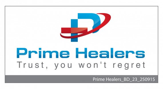
A Logo for Healthcare Company
Sananda Kumar | Sun, 09/27/2015 - 07:30
Brief from client
We are developing a logo for start-up, which is offering multiple services. Basically, the company focus on 3 services viz. Home Healthcare, Online Doctor appointment & Second Opinion services.


4 Comments
This logo isn't really working for me. The symbol looks too complicated and needs to be drastically simplify (chiefly by removing that swoosh)
Though the main font isn't bad, the treatment you gave to it is utterly dated, very 2000, if I may say, when reflection effects were all the rage. Same for the symbol. The font for the subtext isn't working aat all. It's too big and doesn't compliment the main one at all. Plus, that comma shoudln't be there.
Good luck!
Please find the simplified version? What more changes can be done?
Thanks
This is 10 times better than the first version.. I'm still not a fan on the subtext font, but this logo globally works. Good job.
Thanks. Will make changes to subtext.