Brands of the World is the largest free library of downloadable vector logos, and a logo critique community. Search and download vector logos in AI, EPS, PDF, SVG, and CDR formats. If you have a logo that is not yet present in the library, we urge you to upload it. Thank you for your participation.
Version history
Version 1

- I
- S No votes yet.
- T
- C


8 Comments
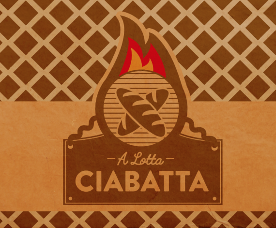
This logo has some really cool potential but it needs some major fine tuning.
Particularly the flames. It's not enough to just duplicate each one on top of the other. You also have to adjust the curves every time you do it. Right now, these curves look a bit too stiff. give them more girth. Do not hesitate to use ellipses to flesh out those flames like in the exemple below.
Not a fan of the background. A logo looks never better than on a clean white background.
keep it up!!
I think this looks pretty good...but there is soooo much brown!!! Different shades and parchment textures, etc. I'd rather look at the logo by itself without all the extra distraction around it. I'm digging the type choices and design, but maybe the flames need some work. (this is made worse because they are the only thing of color in a sea of brown!!!)
I think you should upload a simple version for us to see! =)
I really like this, but I have to admit, I love Shawali's flames! I think the grid can go...it is truly taking away from your logo. I am also a bit concerned about the bread. I think it looks more like loaves of French bread. I wish I had a solution for that. I think of ciabatta as having a long ridge/cut down the center or no split at all. If you Google Ciabatta, you will see what I mean. I guess it all depends on who is making the bread, but it really looks like French bread.
The grid/background can't go,
This is going on a fully wrapped food truck, the grid is part of the entire design, which also includes other graphics relevant to their branding.
I do really like the flame suggestions though, so I will definitely take that advice.
For reference for how this food truck looks.
They sell more besides just ciabatta, but they mainly use ciabatta as their bread source.
I see- thanks for posting. Now, having seen this I have one more suggestion. Have you considered bringing that red color into the logo somewhere other than just the flames? To help tie it together? It just bugs me that the red only occurs in the flame, but there are a lot of elements to the design. For me, it's sticking out right now, I'd add more or just go with the brown/tan colors only. Just a thought.
***One more thing- forgot to tell you this is looking really nice! The illustrations are very good- but the bread on the left doesn't quite match the illustration style of the other foods. Are these stock or handrawn?
It is unfortunately a mix of stock and hand drawn. (well, illustrator vector. I have a bad habit of putting all my stuff straight into illustrator instead of hand drawing it first). They had previous branding that I've had to mix together. I did a lot of custom work on the hot dog, wrap, etc. I'd rather have used all hand drawn, but I am not getting paid for that amount of time.
I thought about that too, but I don't know where I would add the red that would look natural. Would integrating it into the typography make it illegible I wonder?
I believe that if you apply the red on that plate where the sign is, it would look cool, thus making visible the circle surrounded by fire.
Give it a try, good work.
------------------------
Acredito que se você aplicar o vermelho nessa placa onde fica o letreiro ficaria legal, tornando assim visível o circulo envolta ao fogo.
Experimenta isso, bom trabalho.