Abbaye Caves
Manostudio | Mon, 03/19/2012 - 18:41
Brief from client
Make a modern and youngest logo than the old one existing.
The client is the 3rd génération of liquor créator in his family.
He wanted to show the "artisanal" face of his enterprise, and his own festive personnality.
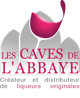
A second version, more traditionnal.
The 3 abbey arches symbolise the 3 génération of liquor créator in the client family.
7 Comments
Dont like the font used, and the way you put words on bottom
The idea is not bad...But you need to emphasize elements...as for example the glass ... or just the text...With finishes ... it is surely something beautiful
Like version 1 much better - has a more whimsical feeling than this version.
I must appreciate your idea. I think font and color could be used more better.
i do like it, love it like a general idea but if they're liquor distributors, the emphasis, in my own point of view and like a first impression is if they're wine distributors... or maybe i'm lost in translation, lol
Do some change because you have force with some graphic elements...
i don't like it, I don't understand the logo...you need to erase some elements...but onest, i like the ideea of the glass.