Accentric
Irfanovickhan | Thu, 02/09/2017 - 12:35
Brief from client
This is an imaginary client for my practice work.
Concept:
Accentric is a European company that makes and services computers and systems.
The brand is inspired by Microsoft.
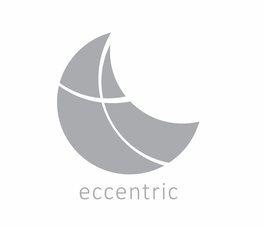
I made this logo for an "imaginary client".
The idea was to make a simple, minimalist logo that could be catchy.
The lines remind of Microsoft.
The almost "e" shape is to do with the roots of being a Europe based brand.
The overall shape, look and feel was to reflect the name ACCENTRIC.
As nothing really lines up.
I thought this would give a feel of "doing things differently"
2 Comments
The logo remind me the moon with a cross inside. The shape of the moon would be perfect for a baby or maternity brand because it refers the Sacred Feminine.
The cross could be a representation of the baby inside the mother.
Overall, your work is great. Insure that your logo matches your idea and the name.
Wow .. that is extremely useful... I just made that up without any sketch or research. It just felt right.
From your comment I learn that I must have a set goal before I even think of the design, and I will work on that.
Thank you so much for the guidance...