'Ace Dental
Socal Graphiks | Sun, 03/08/2015 - 06:38
Brief from client
My client asked for a dentist logo what do you guys think....
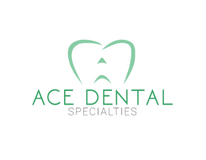
They didnt really have a concept or anything
My client asked for a dentist logo what do you guys think....
They didnt really have a concept or anything
6 Comments
Good idea but the symbols doesn't do it justice. It's too flimsy and looks it's been done in 5 minutes. I can hardly see a tooth nor an A.
Keep working on it, you definitely onto something here.
It almost looks as though the tooth is frowning. The triangle of the A gives it a jack-o-lantern feel, that's where the frown is coming from. I think the colors are too muted and/or the font is too light.
Now that I look at it, it kinda looks like a unhappy one-eyed little monster =)
I don't mind the colors, but I do think that at least "specialties" should be a bit thicker.
I see that the symbol is a tooth, but I didn't realize it was supposed to be an A until Shawali said something. I kiiiiiiiinnnd of see it, but I definitely think it should be re-worked. You are on track for something great here, but definitely keep at it.
To add to what said above, I do not think you need 2 different greens that are very close to each other.
It's a good start, but the symbol needs a bit more work. Keep the font simple, but, as the other said, make a bit more thicker.