Agencia Tower
willsimao | Tue, 01/14/2014 - 01:37
Brief from client
We are opening an Design Agency.
The first objective is create brands and visual identity but we are working with ads, print, and social media content.
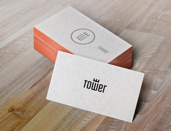
The name TOWER want to show our solid ideia/concepts allyed with creativity and new way to think.
What you think about, please rate and comment :)


12 Comments
The logo and even the mock up looks sweet to me. :)
logo is strong to stand alone... i like the symbol to pretty creative, and simple.
Thank you stephen!
fuck yes!
Like it very much. Simple and clean logo.
Smart!
Simple and clear, you did a good job on the logo.
The icon confused me for a second, I was trying to figure out why there are 2 Es one is smaller than the other (That happened because the the icon is not straight).
great job!
Nailed it. Congrats.
I'd really like to know how you make these mock ups =)
Shawali... i use Pixden to create mocks for different things.... its excellent!! it has such a good library of mock ups as psd files where all you need to do it literally import your artwork in and it creates it for you. It costs money for the better mock ups but a yearly subscription isnt a lot. Another good one is PSDcovers.com the mock up arent so good but they are free. :)
Thanks you all guys!
We are very proud of the result and comments, sooner we'll have our social channels and stationery to show for you :)
Take that one all the way to the bank!
I think it's pretty clear that you have a winner here.
Simple. Iconic. Global. And to your point, it does speak to the strength of your ideas and design capabilities.
My only initial concern was the logo as a stand alone...that I wanted it to utilize the "T" instead of the "W" in the middle. But that concern is negated by the fact that - as a stand alone logo - the "W" is not really a "W" but rather the base of the tower...so it becomes a graphic icon and not a letter.
Job well done.
My only confusion was the logo. I thought it was a crown at first. Stupid me.