Brands of the World is the largest free library of downloadable vector logos, and a logo critique community. Search and download vector logos in AI, EPS, PDF, SVG, and CDR formats. If you have a logo that is not yet present in the library, we urge you to upload it. Thank you for your participation.


11 Comments
I prefer this version of the logo, as the text underneath was distracting from the main text.
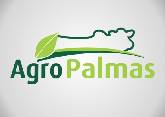
The colours work, but the cow doesn't seem quite right and looks like an afterthought. I like the font you have used, but the 'A' doesn't seem to match the rest of the text, as it doesn't have the same rounded feel as the other letters.
Is this the final version?
that cow, makes at all very weird, But i like the typo and the colors maybe you need to take an other angle of the cow, fill it with color and cut-out the leaf. Anyway try some more!
Almost there!
Not bad but still bad. There s too much empty space inside the symbol(s).
I would suggest you to keep one symbol, the leaf or the cow. Font choice is ok, just watch the kerning and try to tighten the letters more.
What is the hump on the cow's back?
It is a breed called Nelore, very common in Brazil.
Interesting, never seen one before!
also bulls do have that "thingy"
I dont think that u should only use the leafe ore the cow...like ur connection between these to icons.....think the white space in the middle accents the markdesignation
The logo design is good, very good, but could improve on the idea
The symbol doesn't work. The combination of strokes and plain shapes is the main reason. Keep it simple. Keep the leaf or the beef, but not both.
Something like that simple :-)
http://www.artlebedev.ru/everything/gorky-park/identity/
I like it.