Air Rec Center indoor bike park
James Vincent5 | Wed, 12/11/2013 - 22:03
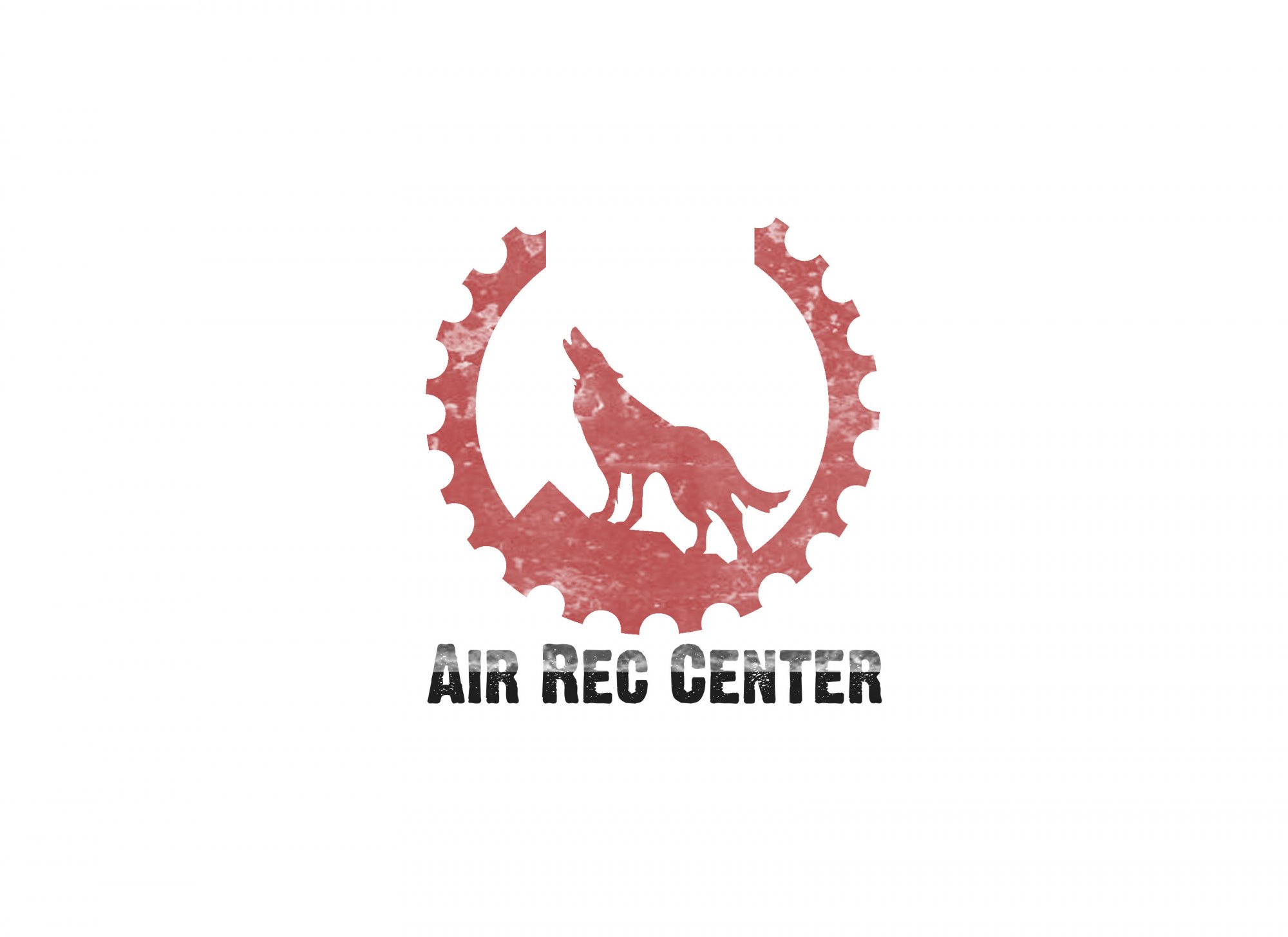
Brief from client
Looking for a stand alone logo for my indoor bike training complex Air Rec Center (ARC). Located in beautiful Vancouver Canada i would like a logo that embodies the rugged nature of the place.
as such: mountains, trees, trails.
And or wild life, example: wolf.
Any Letterform style graphic could work out as well.
Air Rec Center is, a warehouse filled with dirt jumps, wood ramps, and stunts specifically targeting BMX and mountain bikers.
looking for a logo that can be easily recognized, be placed on riders helmets, have the "cool" factor and not be to complex.
2 Comments
I like where this is going. I'm just not sure about how clean and abrupt the cutout in the gear is. Is there a specific purpose to it being there? The only thing I could think of was to make an ARC but arcs are typically ascending. I like the texture and it will simplify to solid colors to make stickers/decals just fine. You might want to dial down the erosion to the text for readability. Cool start. i think you're on the right track to capture the essence of your clients brief.
It's a really cool logo but these caps in the text are putting off a little bit and the teture is a bit of an overkill.
Good job though.