Alpendre Critique
QBdesign | Fri, 11/14/2014 - 13:41
Brief from client
My client wants a logo based on the existing restaurant name "O Alpendre" (restaurant reopening). The meaning of the this mame is porch/terrace that exists at the entrance of the restaurante (the portuguese translation is alpendre).
The logo must be elegant, modern, but at the same time have a slight touch of rusticity to preserve some memories...
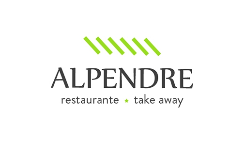
Basically I've created an icon/mark focused on the entrance porch and the typography choosed to make that slight touch of rusticity.
https://www.behance.net/gallery/17894543/Restaurante-Alpendre
5 Comments
Love it. Sometimes a few strokes can go a long way! Love how you worked out mockups of the new identity as well. Good job!
This works well, I think. I might make the lines flat on the top and bottom, just to give the lines a sense of form to the look you're trying to achieve, so the lines would look like parallelograms.
Other than that, It's a good look. The green might look a bit too bright against white, but you can experiment.
Tanks for you point of view!
I agree with the color but it was chosen by client to be similar to the color of some interior walls... The final result, when printed it makes a good contrast and good reading ;).
I like it but for me the symbol doesn't inspire me. I really like the font and the work you have done to it and to me it looks like more time was spent on this part and less on the symbol. The 6 green lines don't look like they represent anything, i know you have said in the description that they are meant to represent the entrance on the porch but without seeing the porch or knowing that its meant to represent it they come across as just simply 6 green slanted lines which is pretty lackluster. I also think the green is a little too bright.
Agree. I would not relate the lines to anything without reading the explaination.