Alta Huerta
neterniut | Tue, 05/10/2016 - 23:32
Brief from client
Alta Huerta makes kits for urban gardening (reciclable pots, seeds, soils and some others stuffs)
The brand should show the essence of Alta Huerta activity, playing with the straight lines of the city mixed with some more organic elements.
The product ist pointed mostly to a young/adult public, middle class, urban dwellers (of course) with ecologic and kind o 'hippie' concernts.
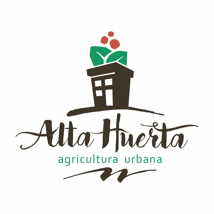
There's a wordplay in Alta Huerta's name. In Argentinian slang, it means both 'high or upper garden', and also 'awesome garden'. So I tried to use that, shaping the building as a pot... or the pot as a building.
8 Comments
I really appreciate the idea behind the pot/building. I think it works pretty well. I'm on the fence about the headline font! (it's trendy, but it feels a bit like a wedding invite font!)
I would say the "swoosh" at the bottom is not really necessary. It does not add anything to the design, I'd remove it.
Nice work!
Thanks for your comments, j.o.y!
I think the same as you about the 'swoosh'... I gess I just tryed to add something in the base to hold all the set of elements, but -as you said- it doesn't add anything.
I will work on the typography... My idea was to use a gestural one, someting handmaded like, and I prove several before picking this one an add a few modifications. Maybe those modifications -lots of twirls- makes it so 'weddingist'.
Thanks againg for your help, and greetings from Argentina!
I like your idea but not a fan of the font, i do not like those curly line it has. Great job in rest:)
I agree with the font comments. I do like the building/pot, but you seem to have a mixture of eroded lines, smooth lines and odd curves on the leaves. But that's just me.
I think you have a cool concept here but it does still need some work. The leaves and berries have a nice organic roughness to them but the right side of the right leaf is a hard line. I'm thinking you have this roughness with the building/pot as well so it looks more consistent. I agree that the scribble swoosh at the bottom should go and I'm not 100% on the font either but I do like that it has some of the rough characteristics of your symbol. You have a nice direction going here.
This logo has great potential! Kudos on the hand lettered word mark.
That being said, you're not done yet. Globally, it feels a bit too complicated. Righ off the bat, get rid of that squiggly thing under the sub text. It just complicates things without bringing anything to the plate.
The hand lettering is great but I think it needs to refining. It needs to be streamlined.
The symbol is a bit too prominent I feel compared the word mark. The two are kind of struggling for attention. Also, when I first looked at it, I didn't see a flower pot right away. Mainly because it's a cube and for me pots are usually round.
Anyhoo, you're off to a great start. Let' see what you can do to make it even better!
Keep it up!
In his/her? defense- the plants you buy from garden centers or nurserys usually do come in little square "throw away" pots! =)
you've done a nice job!
but the shape you have under your subtext isn't needed !