AM Workshop
Alex.Medinilla | Mon, 12/07/2015 - 23:43
Brief from client
Alex Medinilla Workshop
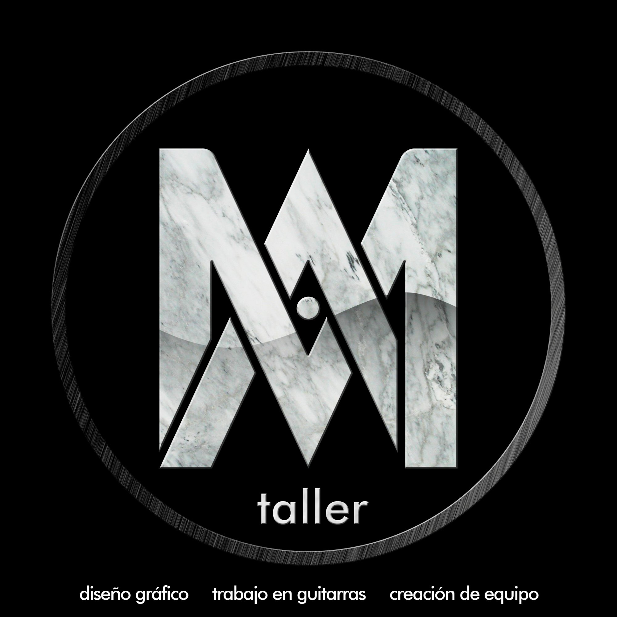
This is the logo of my Workshop (Alex Medinilla Taller), I use Corel Draw & Photoshop, is the letter A and M interlaced.
Alex Medinilla Workshop
This is the logo of my Workshop (Alex Medinilla Taller), I use Corel Draw & Photoshop, is the letter A and M interlaced.

 Partnered with Clios.com | Ads of the World
Terms of Use | Privacy Policy | Cookie Policy
© 2021 Clio Awards LLC.
Partnered with Clios.com | Ads of the World
Terms of Use | Privacy Policy | Cookie Policy
© 2021 Clio Awards LLC.
3 Comments
I'd like to see this simlified a lot. The gradient and texture on the logo can go, I think. Also, consider choosing subtext that's more concise. The bottom row looks like an afterthought. I almost ignored it since it's so small and not part of the main circle. Also, what's "Taller" mean?
You have a solid idea, just needs a little refinement.
I agree totally with TheKillswitch. The marble needs to go. The shape of the M and A intertwined works. I don't think you need the confining circle at all. Nice start! Am interested in your answer to TKS's question about what "taller" is all about.
ok so i love your symbol but i would dump the gradient for sure and that circle you have around it.
you should also rework on the bottom text.