Animaux
bettialva | Fri, 06/20/2014 - 06:38
Brief from client
This was a logo for a new spa for animals, the client wanted to share thru the logo the scent of a classy and a different way to treat your pets. His goal was to get to certaing people located in a luxury area in Cancun, Mexico.
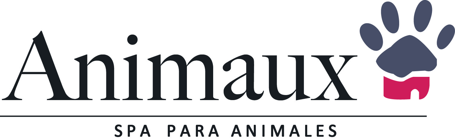
Serif typos were used in the desingIn this logo, a serif typeface is held to represent and convey the luxury that the customer wanted. Was modified a bit to suit the customer's taste. Similarly visual aid was used as a dog paw with cufflinks once more towards the type of spa allusion to which he referred. To request the name was in French because owner is French and at the bottom divided with a line, we placed the business which is a spa for pets.
2 Comments
I like the symbol but the fonts just don't match and I think you should use the grayish blue color for the font rather than having black added.
The symbol looks a lot more fun and curvy (could still be cleaned up but the idea is there) and the text is very formal and stiff. I'm also not a fan of the horizontal line separating the the subtext. It doesn't add to the logo and it looks as though you didn't really know how to incorporate the subtext.
I would keep sketching and exploring different typography. You also need to decide if this logo is going to either be informal pet fun or clean and luxurious, not both.
Good luck to you and I look forward to seeing future versions.
Thank you! Actually that was the first work I did back when I was fresh starting.