Antuares
josplit | Mon, 05/25/2015 - 23:39
Brief from client
lawyer logo
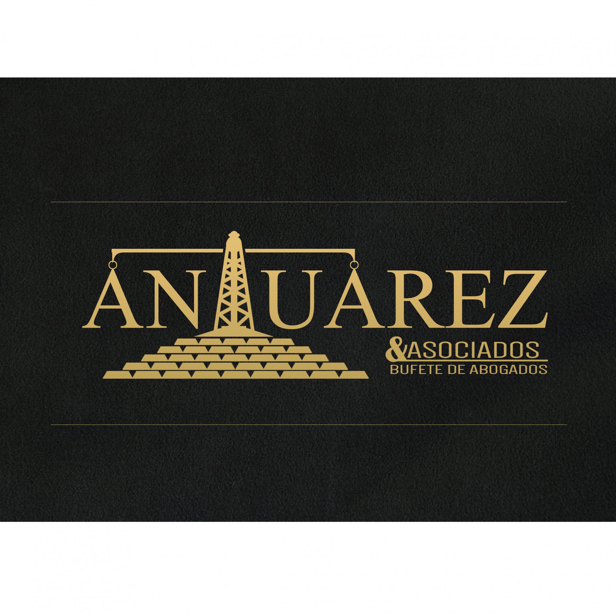
This concept is being reviewed by the client, is a simple theme based on ideas of the same customer and its former logo
lawyer logo
This concept is being reviewed by the client, is a simple theme based on ideas of the same customer and its former logo
4 Comments
the idea is okay, although maybe overused.
i would make the scale of justice a little bit more minimalistic/silhoutte, as for now if you scale it down all detail will be lost and you'll end with what i just said only messy.
i like the font you're using, it has a sharp edge lawyers need and it gives a feeling of trustworthyness to me...although i don't speak...spanish i guess.
also like the yellow/goldish color you use for this logo
haha I thought the same thing will make changes to minimize the elements already discussed with the client, reducing the bullion above all, thank you for your criticism, sometimes you have to push the client, sometimes do not know what they want.
Excellent idea! pero no me gustan las lingotes de oro, el resto esta Ok!
Sorry, I don't think this logo really work.
Right off the bat, the readability is off. I read "Anuarez".
Overall it's way too complicated. An oil pump on top of a pile of gold bars, plus the subtext which is a whole logo on its own... Way too many elements, which defeat the purpose of what a logo should be. Simple, to the point and memorable.
Do these lawyers deal with gold and oil? If so, remember that a logo is better off leaving a lasting impression rather than being informative. You don't have to put oil rigs and gold ingots, like McDonald's doesn't have a burger in their logo or Nike as a running shoe. See what I mean?
I really like the color scheme, though. It gives an idea of seriousness and quality.
Keep it up!