Brands of the World is the largest free library of downloadable vector logos, and a logo critique community. Search and download vector logos in AI, EPS, PDF, SVG, and CDR formats. If you have a logo that is not yet present in the library, we urge you to upload it. Thank you for your participation.
In fact, can you remove the phone number and Insta just so we are sure you post this to get valuable feedback from your peers and not advertise your business?
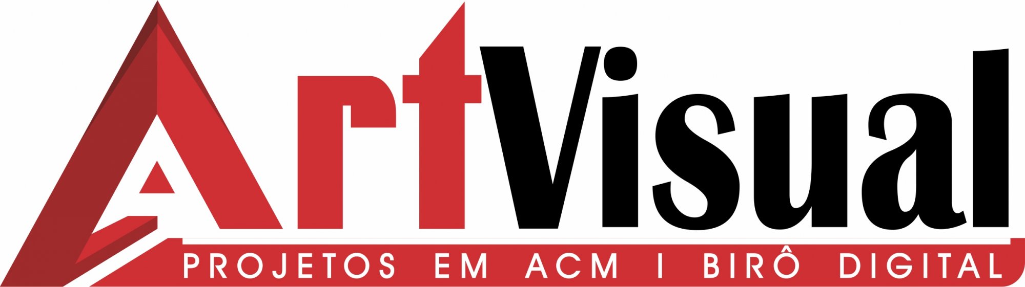
This logo looks more like a header on an old webpage or for a printed ad. Not really a logo or a brand. I like the A in the logo. But no one can read the text in the lower red bar on something small like a phone or business card. For something that seems to demand something clever and creative "art visual" I would avoid going with these two fonts (that don't really pair well together). This feels 1970s-ish to me. I would completely rethink this and start from that A and work outwards. Remember: less can be better.
4 Comments
You should remove the phone number and Insta, they shouldn't be part of the logo.
In fact, can you remove the phone number and Insta just so we are sure you post this to get valuable feedback from your peers and not advertise your business?
Obrigado ;)
Thanks for removing the phone number and IG account!
Now, unfortunately, I'm not a big fan of this logo. It looks dated and needlessly complicated.
There are toomany different types and the subtext shouldn't be integral to the logo.
The modified A is interesting but should serve as the symbol and not as part of the wordmark, IMHO.
This logo looks more like a header on an old webpage or for a printed ad. Not really a logo or a brand. I like the A in the logo. But no one can read the text in the lower red bar on something small like a phone or business card. For something that seems to demand something clever and creative "art visual" I would avoid going with these two fonts (that don't really pair well together). This feels 1970s-ish to me. I would completely rethink this and start from that A and work outwards. Remember: less can be better.