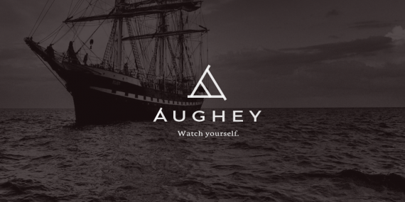
Aughey
IamTrent | Thu, 05/07/2015 - 12:20
Brief from client
I'm designing a personal logo that would be used for a range of purposes. I plan to mostly use it on watches that I'm designing and building, the slogan is still a work in progress.


28 Comments
the only thing that bothers me is the subtext. i would go with a sans serif, demibold, not a classical serif like you did.
Thank you, I wasn't really set on the subtext, I'll try a couple of iterations, the slogan text isn't finalized as well.
This nail has been hammered right on the head.
Great job!
Great!
Very nice! i agree with Hueroth about the sub text though
Yes, I feel the triangle change, transformation and adaption. Good job!
Yes! this is a brilliant idea, very well.
Agree about the sub line.
Very well done
This logo is dreamy! ♥
Font is fine and a symbol is not, I have seen this symbol before, by the way.
Where have you seen the symbol before? Can you please find it again if it is possible? We take plagiarism seriously around here, it is not a term you can throw around without proof.
Please show us.
Phorographs cannot be used with symbol. And if it is not your photograph - please, mark a credit for one who did it.
I think it's fairly obvious that the photograph is simply background imagery that would appear on branding. It feels like you're being just a tad passive aggressive here, since we've pointed this out to you before.
But.... http://www.brandsoftheworld.com/critique/personal-id-logo-4
Love it. I'll echo what others have said about the subtext, since that point wasn't driven home already or anything :)
Please, no photograph(s) with logo/symbol. Thank you.
Being someone who has a deep interest with triangles I think this is well done, but just borrows almost too heavily from audio technica (first thing that flashed into my mind when I saw it)
The idea is good but I would like to see the symbol come in a bit more so that the edges stick out more. The type is good but I would eliminate the additions to the "A" and just have it remain the same as the other letters. The tagline is okay but I would just focus on the logo without it for now.
Very clean and simple, I can offer no constructive criticisms. In addition, I like the image in the background that some are confusing as part of the logo. A variety of licensed or public domain vintage images with the same treatment as backgrounds for ads, web headers, etc., would be a great addition to your branding. Well done.
In ACE Hardware store logo - an " A " looks exactly the same.
Only no outline with the serif like extensions, reversed in red, italicized, with a 'C' and an 'E', other than that....
I don't see the Ace Hardware logo and think Audio Technica or the Aughey logo, or vice versa. Each logo has its own personality, despite one similarity. None of them blatantly copy each other.
Exact the same " A " with the same motion - I rest my case. Spamsistency.
If I'm being frank, you have way too much to learn about graphic design to be in any position to pass such judgement.
I haven't spent anywhere near as much time on this board as Charlie, but I fully agree, just saying "No that is wrong" with no reasoning other than "I don't like it" is not a helpful critique. This is a place for those of us with experience in the industry (decades I hate to admit), and the type of mind set to see the details, to pass on guidance and what we have learned works/doesn't work to those willing to learn and grow. If you can't see the difference between the two logos then you may not have developed the latter. An example of this is telling someone "Never use a photo in a logo" when A: you have submitted logos with photos and B: you can't recognize that the photo is not part of the logo. Spend more time watching and learning, hone the skills you do have and contribute in a way that someone can turn your critique into a learning moment.
Then you're either blind or trolling. And I'm starting to suspect the latter the more and more, especially when you constantly tell someone they have obscene imagery hidden in their logo, when in fact a perfectly reasonable conclusion is that the logo in question is innocent of such interpretations.
But back to the topic at hand: if you cannot distinquish the logos of Ace, Audio Technica, or Aughey, then you should make an appointment with your optometrist. There is no reason why logos cannot share a characteristic without losing their unique identity.
If your entire "case" rests on the fact that the "A" has the same shape, you're still wrong. The triangles are completely different in each logo. Ace's bold, red slanted letters are what make it unique. Audio Technica's logo is taller than it is wide. Aughey's logo is equilateral with stems on each corner. They're all unique.
By the same logic, you're not allowed to include any soccer balls in sports emblems, and you should redo all of those logos you've posted for Russia 2018.
And I was so sad when the logo I posted that actually had hidden sexual imagery... was ignored by you. *sniff*
You broke my heart Bopota.
Love this, the image in the BG just finishes it off! Great work.