Brands of the World is the largest free library of downloadable vector logos, and a logo critique community. Search and download vector logos in AI, EPS, PDF, SVG, and CDR formats. If you have a logo that is not yet present in the library, we urge you to upload it. Thank you for your participation.
Hehe, okay you SAID to be hard- so I'm just gonna give it to you straight.... Ready!? Take a breath, it'll be okay! ;)
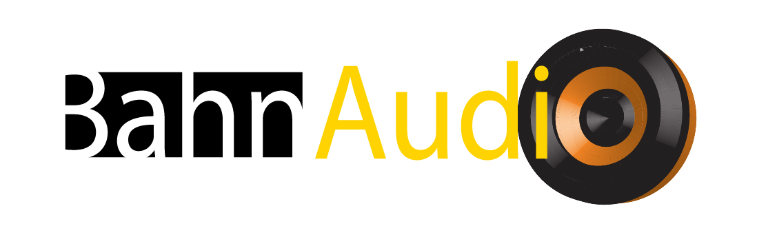
This doesn't work. I won't sit here and write down every rule of logo making, but here are a few things for thought:
-Never use a chunk of photoshop clip art (ie- the speaker in this instance) in your logo- ESPECIALLY not as a letter. It doesn't read as Bahn Audio, it reads at first glance as Bahn Audi. I'm assuming you're not selling cars, yes?
-The yellow text is really hard to read. That bright of a color on a white background isn't your friend!
-The reversed out "Bahn" just .... there just doesn't seem to be much point to it, you know what I mean? It kind of looks like you just figured "Hey, having it reversed is something... I'll do that to theeeee first word!" - too random without purpose.
So honestly, I'd give you good marks for trying- but I think you need to ditch this idea and start anew. As I say in many of my critiques- sit down with a cold beer and a blank sketch pad, think about the company you're designing for and start sketching. See what comes out- and then make a new start!!
Nice! the type of comment I was expecting! Here in Mexico the client is driven by aesthetics, but not by the functionality of the logo, you have made me see my mistakes so I will put to create something better.
P.S. I did the speaker in Adobe Illustrator using the effect "3D turning" I never would use a clip art, never ever.
3 Comments
Hehe, okay you SAID to be hard- so I'm just gonna give it to you straight.... Ready!? Take a breath, it'll be okay! ;)
This doesn't work. I won't sit here and write down every rule of logo making, but here are a few things for thought:
-Never use a chunk of photoshop clip art (ie- the speaker in this instance) in your logo- ESPECIALLY not as a letter. It doesn't read as Bahn Audio, it reads at first glance as Bahn Audi. I'm assuming you're not selling cars, yes?
-The yellow text is really hard to read. That bright of a color on a white background isn't your friend!
-The reversed out "Bahn" just .... there just doesn't seem to be much point to it, you know what I mean? It kind of looks like you just figured "Hey, having it reversed is something... I'll do that to theeeee first word!" - too random without purpose.
So honestly, I'd give you good marks for trying- but I think you need to ditch this idea and start anew. As I say in many of my critiques- sit down with a cold beer and a blank sketch pad, think about the company you're designing for and start sketching. See what comes out- and then make a new start!!
Nice! the type of comment I was expecting! Here in Mexico the client is driven by aesthetics, but not by the functionality of the logo, you have made me see my mistakes so I will put to create something better.
P.S. I did the speaker in Adobe Illustrator using the effect "3D turning" I never would use a clip art, never ever.
Hehe- good to hear!! I look forward to seeing a new revision!! :)