Bailey Supercars jacket logo
Brief from client
This is a custom sewn on jacket logo/illustration for the back of an all black mechanic's work jacket. My client lives near the Blue Ridge Mountains, and wants one of his company logos to convey ( or express ) the freedom and excitement of taking a fun cruise to new locations... escaping from the normal everyday congestion and general suburban life.
This design is a simple reminder that the products that he can create are some really fun toys; vehicles that can not only be used at car shows, but also used when a sick day from work arrives, or when someone just wants a fun day of uncharted back road exploration.
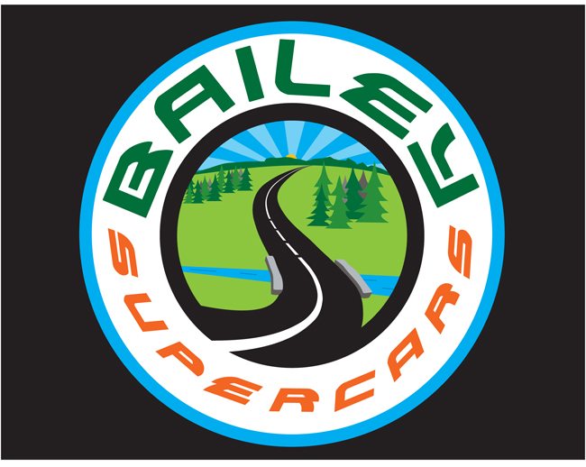
This illustration is intended to be sewn into the back side of an all black mechanic's work jacket; Specifically: it's a really nice quality "work" coat, and it's Intended for use as a social media advertisement item. It can be used at car club events, car and motorcycle shows and events, and even local cruise ins while using completed vehicle projects, and as a way to help showcase the most current work(s) to leave the garage.
Business cards are to be kept in one of the upper coat pockets, and after a small sales pitch is given to select potential clientele, a few cards get handed out, and hopefully a new project is contracted. The circle art is about 8" in diameter and sewn into the coat at shoulder hight on the back side. The front side of the coat gets the "Bailey Supercars" logo ( also seen in this critique forum ) sewn on the front right upper chest area of the coat.
6 Comments
I think font is not for the middle circles font
and I think
bla bla bla
for not super cars...
This is more of a t-shirt graphic than a logo. As a logo, it is way too busy and colorful. The idea is there. Have you ever seen this posts where it shows the transition of a graphic to a logo. I think Starbucks is one that I see a lot.. I'll find it. But I think you are at the first stage of that (maybe second : )). IF you are going for a logo.
Here is a site:
http://www.instantshift.com/2009/01/29/20-corporate-brand-logo-evolution/
Thanks for the nice comments. "Bailey" is an Irish name, so we picked a simple bright color green for the name. The blue/white/orange are colors that just go well together... and as a graphic on the back of a coat, we were looking for the image to be quickly recognizable. The rest of the story is in the illustration, and you're right - it will also evolve into a company T shirt. This is really the illustration for the back side.
Can't change the fact that starbucks has a circle logo, But yes, this image will evolve like the Starbucks designers did with their original logo. I'd like to get this one down to just two colors... and that's what I'm working on right now. But my boss - he wanted it to be very much like what has been done. So for now, this is it. I gotta do what the client tells me they want - first - then I get a second round and will work it into something smooth.
Thanks for the feedback...!
K
I had a feeling that was the case! Good luck.
ugly / too many colours / thats a symbol 4 woods or something, not 4 cars
I think the idea works, but you need simplify the illustration. Make a logo instead of an illustration if you know what I mean. Also simplify the typography especially that it's wrapped around a circle.