Barber Shop 2
Limitless Design | Thu, 03/31/2016 - 11:13
Brief from client
The barber shop 2 logo design
Created by Limitless Design aka Dee Kostopoulos, Thessaloniki, Greece
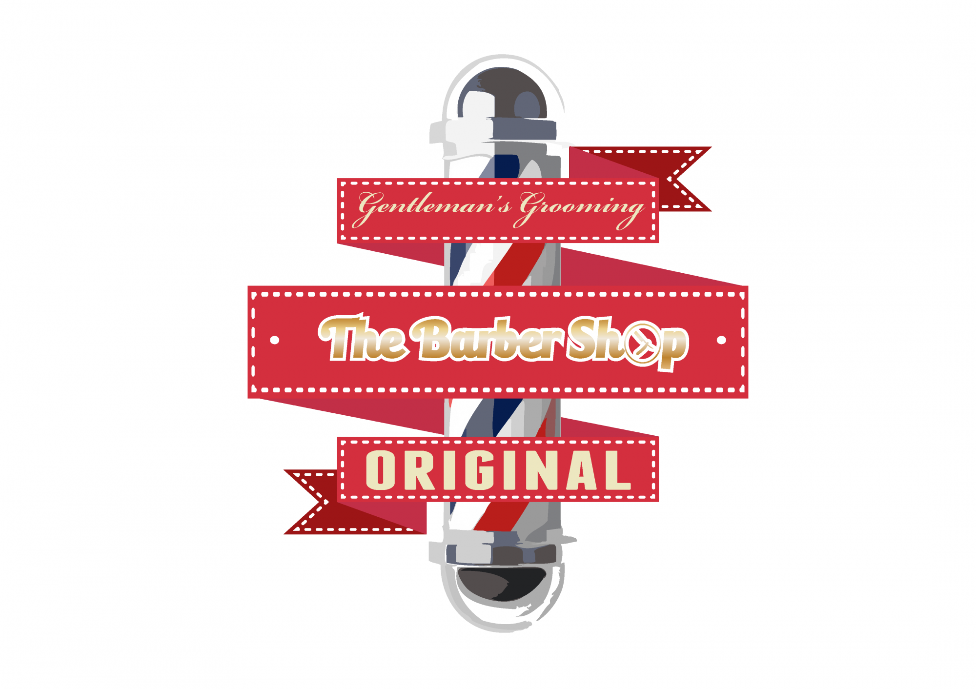
The barber shop 2 logo design
Created by Limitless Design aka Dee Kostopoulos, Thessaloniki, Greece
8 Comments
The only thing I would like differently is for "The Barber Shop" to have been a solid color. Other than that I love it! And I love the razor in the circle that stands for the letter "o" in "Shop". Brilliant!
Again, as the first version, too much stuff here. Less than the previous version i gave feedback to, but still too much. Keep things simple.Think about scaling this to be printed on small stuff like lighters or ball pens.
The Original Logo is the "The Barber Shop" the rest i m putting next to it or that surround the logos are because the desired result was in order to be put in a banner or smthn like that! I tottaly agree with you though if the logo was about to be printed in small surfaces it wouldnt be visible!
Thanks again for your time :)
So many details and so many fonts. Try simplifying and see how it works.
Too many fonts. The gradient in the text really kills the readability. There are way too many small details which will cause you a lot of problems as you scale the logo down. The razor in the O of shop is unnecessary small detailing and should go. I'm also suspect that the barber pole was auto traced or clipart. I mean no offense if its not but it just has that tell-tale look. The only thing that jumps out, readability-wise is the word ORIGINAL. I would get back to paper and really simplify. Good luck!
My buddy Jon here pretty much nailed it on the head with his review.
Basically, you have the same problems you had in version 1. Too many bad fonts, unreadable, way too complicated...
And that traced barber pole is the last nail in the coffin. As a rule of thumb, when creating a logo, never use third party elements, such as clip arts or photographs. Basically, avoid anything you didn't do yourself. Tracing a picture isn't a magic tool which turns photographs you didn't shot into your own vector shapes. It just makes a bigger mess, as I said in my previous review.
The ribbon idea is good and can totally work here, but here it's way too straight and uptight. It should be way more curvy, warping itself around the barber pole.
Keep working on it!
Sooooo many things! The barber pole is a live trace gone wrong. Its kind of the equivalent of "phoning it in" - you could probably draw your own so much better, and more interesting if you sketched some ideas out.
All those fonts in one place is like an identity crisis! And the "gentlemens" font is hardly legible even at this size. There is no unity within this logo. Simplify, and then simplify again!
I could only see this working as maybe a sign?? Not a logo. And not even a sign with all those competing elements.
This article should help you : http://www.creativebloq.com/typography/commandments-11410425