Brands of the World is the largest free library of downloadable vector logos, and a logo critique community. Search and download vector logos in AI, EPS, PDF, SVG, and CDR formats. If you have a logo that is not yet present in the library, we urge you to upload it. Thank you for your participation.
This is a very cute concept. I quite like it.
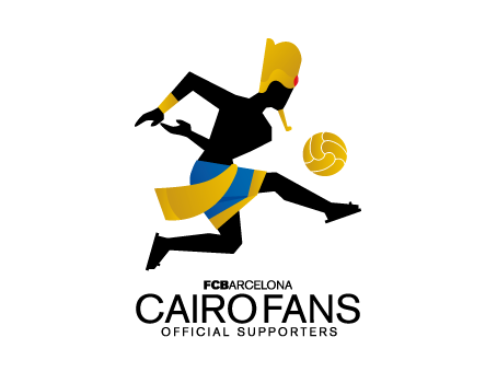
My idea goes along the line of actual Egyptian art. It was drawn like that because the Egyptians believed that if a person was missing a body part in a drawing, then in the afterlife they would be missing it as well.
I would make the tucked in arm shown completely. It would look more Egyptian and solve the problem of losing it in the torso there.
I also think that the sandals should be gold to make them pop more.
Im not keen on the font work - it kind of looks as if all your time was spent on the symbol and then you decided to put a simple font with it.
The symbol is good but i would do the amendments that Shawali suggested and perhaps add the coloured stripes that barcelona are associated with to the clothing. One thing that really bugs me about the symbol is that the hands look like the man is throwing a rugby ball. i think they should be changed into a more natural form of when someone is striking a football.
Other than that its a really solid effort, well done!
attached is what i mean about the arms/hands positions - hope that helps
4 Comments
This is pretty funny. Not a fan of the font work, though. It's being squashed by the symbol. You need to find a better balance.
I would make the sandals gold too and add a bracer to the left arm so we understand the arm passes in front of the torso.
Globally, the symbol is cool but maybe you should add something that link this to the FCB visually.
Good job!
thank u Shawali .. i have another virsion of it ..
This is a very cute concept. I quite like it.
My idea goes along the line of actual Egyptian art. It was drawn like that because the Egyptians believed that if a person was missing a body part in a drawing, then in the afterlife they would be missing it as well.
I would make the tucked in arm shown completely. It would look more Egyptian and solve the problem of losing it in the torso there.
I also think that the sandals should be gold to make them pop more.
Yea this is pretty cool,
I have a few issues though....
Im not keen on the font work - it kind of looks as if all your time was spent on the symbol and then you decided to put a simple font with it.
The symbol is good but i would do the amendments that Shawali suggested and perhaps add the coloured stripes that barcelona are associated with to the clothing. One thing that really bugs me about the symbol is that the hands look like the man is throwing a rugby ball. i think they should be changed into a more natural form of when someone is striking a football.
Other than that its a really solid effort, well done!
attached is what i mean about the arms/hands positions - hope that helps