Beverage Company Logo
ErsinMacit | Tue, 01/15/2019 - 11:19
Brief from client
This is a new beverage company in Turkey. "meşrubat" stands for beverage and it says Ergül Beverage.
Edit: Owner was working with Coca-Cola Company but he left and created his own brand.
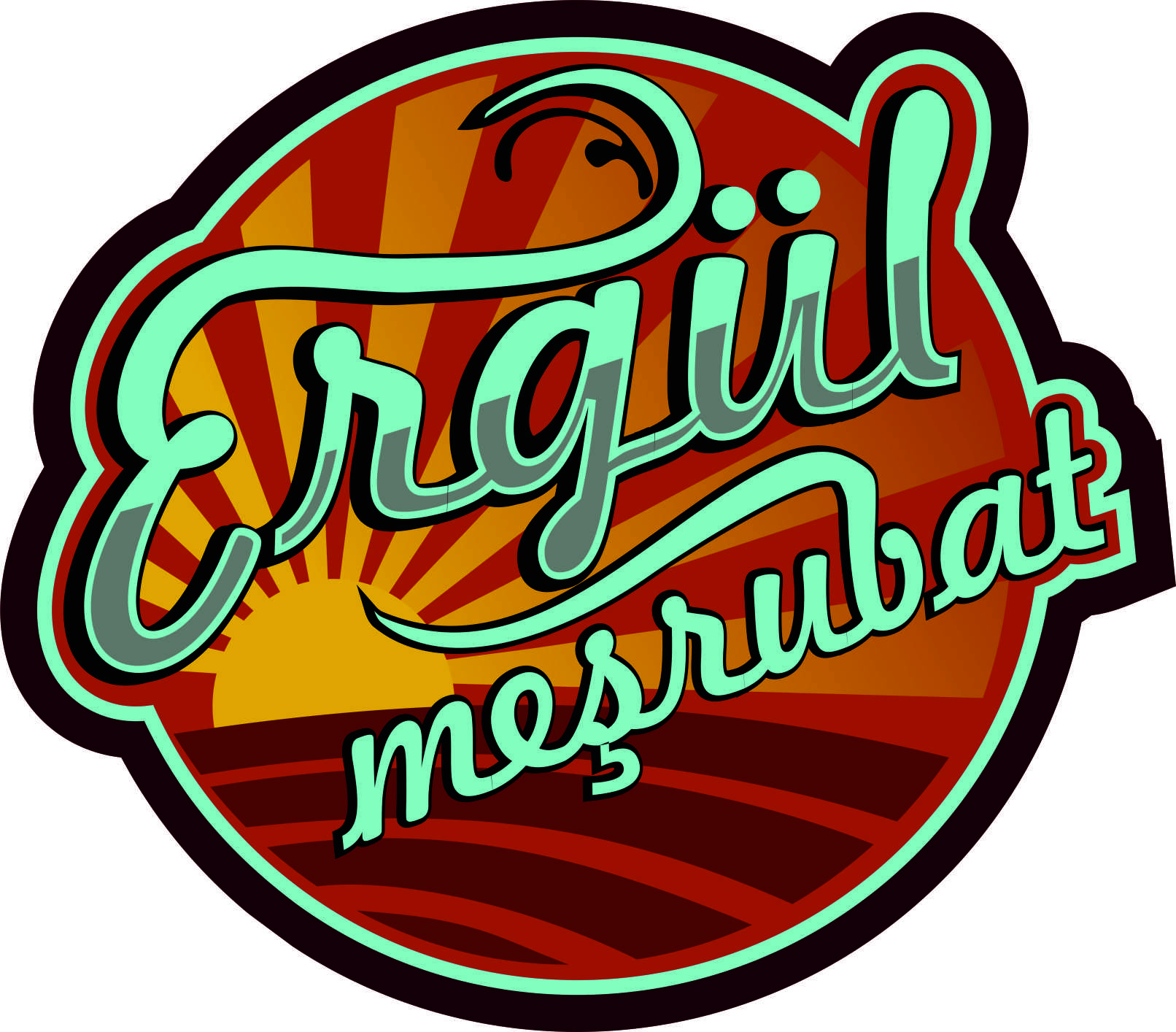
Hello all! This is my first post in here. Thanks =D
I put rising sun behind texts cus dis is a new, rising brand. Actually i'm wondering about what are your thoughts on colours?
3 Comments
Hello- I like where this seems to be going, but needs a lot of refining at this point.
1) the colors look to acid to me- you have really intense yellows and teals and then you have really muddy hues of those colors. I would consult the adobe site kuhler - it has a ton of pre-made color palette suggestions.
2)the curves need refining- the swoosh of the E and B especially. The weird ligature to the left of A and M should be eliminated. And the outline right of the letter T could be smoothed out- right now it has a distracting shape compared to the smoothness of everything else.
3) overall feels a bit top-heavy. Maybe some resizing or moving around of elements would help with balance.
I don't know how I feel about the sun yet- I think the colors are too distracting at this point for me to decide. But I like the fonts and the feel of it. I think with a little cleaning up, this will be pretty nice. Good start! =)
The way I see it, you did not only designed a logo but a whole sticker.
For me, the logo is just the wordmark and the subtext. Really cool you went for a hand made typography. It doesn't look half bad but could use some fine-tuning.
My advice: get rid of all the superfluous background, which might I add feels a bit dated now, with that very Obama 2008 feel to it. Focus on the word mark itself and fix those flimsy curves and you'll get your self a simple yet effective and cool looking logo.
Hallo again! =D
I thank both you for your advices. I'll upload other logos which I made for same company buuuutttttt I used nearly same colors XD the reason for that i think im in love with this color palette. =D