Binary Options A-Z Logo
DavidAdams | Tue, 09/30/2014 - 14:03
Brief from client
A logo for a financial information project http://binaryoptionsaz.com/
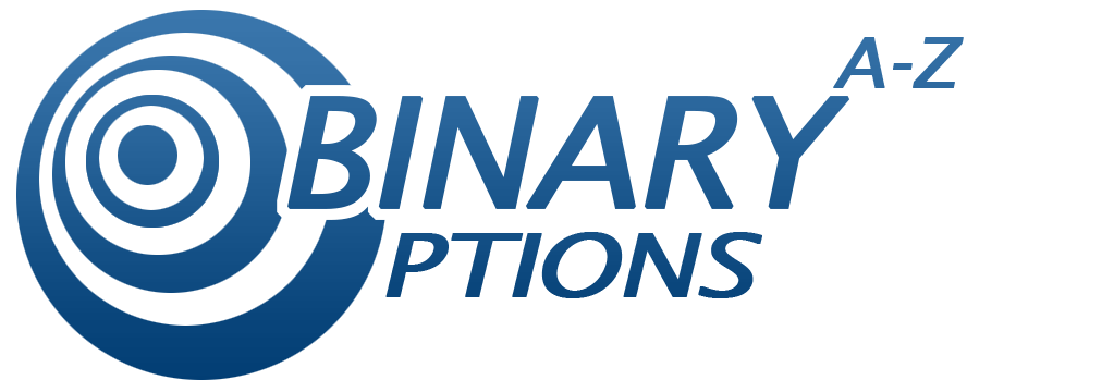
A logo took me around 5 days to make and organize. The Blue color is meant to inject peaceful trust since http://binaryoptionsaz.com/ is an informational financial project. Created in CS5 and some pen & paper.


3 Comments
Nothing spectacular very corporate. Lower text seems very stretched and disproportionate.
*EDIT*
On a closer inspection the lower half of the bottom text also seems to be fading away. That doesn't seem on purpose.
Considering you've spent 5 days working on this i would expect something way way way better! this looks like it took 5 minutes! As Shawali keeps saying on other logos that use a symbol as the first letter... they very rarely work and this is a case of it once again not working. I read Binary A-Z ptions when i look at this.
As said above it looks as if the text has been stretched which is never a good thing. Keep sketching out some more ideas as im affriad this one does not work
I read this as "Binary Potions" at first. The target "O" has to go.