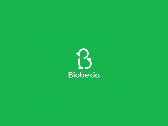
Biobekia Logo Design
AK96 | Tue, 04/07/2020 - 02:05
Brief from client
I need a simple logo but with a good idea the rest is for your opinion

Biobekia is an online platform that facilitates affordable and adequate disposal of waste to individuals as well as business units, promptly. Our customers simply ask us to collect their waste, we give them the market price for these waste materials such as used plastics. BioBekia then resells the plastic directly to recycling agencies, so I designed the logo based on the "B" letter + recycling symbol


1 Comments
Does anyone else only see a chick (a baby bird of some type) here?
I don't see a "recycle" aspect at all with this shape. I know that you're telling me that it is based on the recycling symbol; however, all recognition of that symbol is completely lost here. Instead, I see the chick and a bottom-heavy deformed letter B. I
The rest of this works, the color is acceptable, the font is modern and nice. But the symbol is way off the mark. Why not do something based on the triangular shapes of the typical recycling logo? Those could be arranged to appear as both a B and still retain their recycling logo traits.