Brands of the World is the largest free library of downloadable vector logos, and a logo critique community. Search and download vector logos in AI, EPS, PDF, SVG, and CDR formats. If you have a logo that is not yet present in the library, we urge you to upload it. Thank you for your participation.
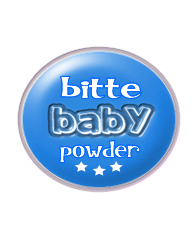
Ok, have a look at "Johnson's" baby powder. They use 2 fonts: 1st for logo and 2nd for words baby and powder. "baby" is written in bold italic, "powder" is written in plain italic. They use something like navy blue on all fonts. Have a look at that on the net or at home if you have a "Johnson's" jar. You don't have to necessarily copy that, but you surely can take some lessons.
I like the baby typo but I would write the other text in a basic font. Having too many fonts is too heavy, keep it simple! The colour is really bad, is there a colour that is baby-like? Maybe a skyblue ?
I don't mine the colours. Too many fonts. The main problem is Bitte looks incidental and not important. Baby powder is only the product, it should be in one font and much less prominent than the company name. After all, Bitte might make other stuff too, if not now then in the future.
yea there are some things wrong with this logo i would start "fresh"..
Get it fresh.. .like a babys bottom... baby powder.... ill be here all week!
there is to many effects you are placing on this logo. too many fonts. the logo does not seam balanced. and the purple is... ehhh... i would suggest starting over.
12 Comments
Too many different fonts. Color is not the most accurate. There is an imbalance between the word BITTE and the rest of the logo. Try again please.
Ok, have a look at "Johnson's" baby powder. They use 2 fonts: 1st for logo and 2nd for words baby and powder. "baby" is written in bold italic, "powder" is written in plain italic. They use something like navy blue on all fonts. Have a look at that on the net or at home if you have a "Johnson's" jar. You don't have to necessarily copy that, but you surely can take some lessons.
I like the baby typo but I would write the other text in a basic font. Having too many fonts is too heavy, keep it simple! The colour is really bad, is there a colour that is baby-like? Maybe a skyblue ?
no dear try something else
I don't mine the colours. Too many fonts. The main problem is Bitte looks incidental and not important. Baby powder is only the product, it should be in one font and much less prominent than the company name. After all, Bitte might make other stuff too, if not now then in the future.
Start over.... Too many things to comment on. Best to brainstorm again.
yea there are some things wrong with this logo i would start "fresh"..
Get it fresh.. .like a babys bottom... baby powder.... ill be here all week!
there is to many effects you are placing on this logo. too many fonts. the logo does not seam balanced. and the purple is... ehhh... i would suggest starting over.
Agree with the other guys - start over
I see the same logo here in Venezuela...if i find that logo i show you...
look for it and show me the link...I believe conventional ideas are nothing to reckon with...
Too many different fonts and it might be hard to read from a longer distance.
maybe use one font for all the logotype and 2 colors the gray and the cyan, and the form, use a circle not a ovoid form