Blue Cheetah Marketing
Brief from client
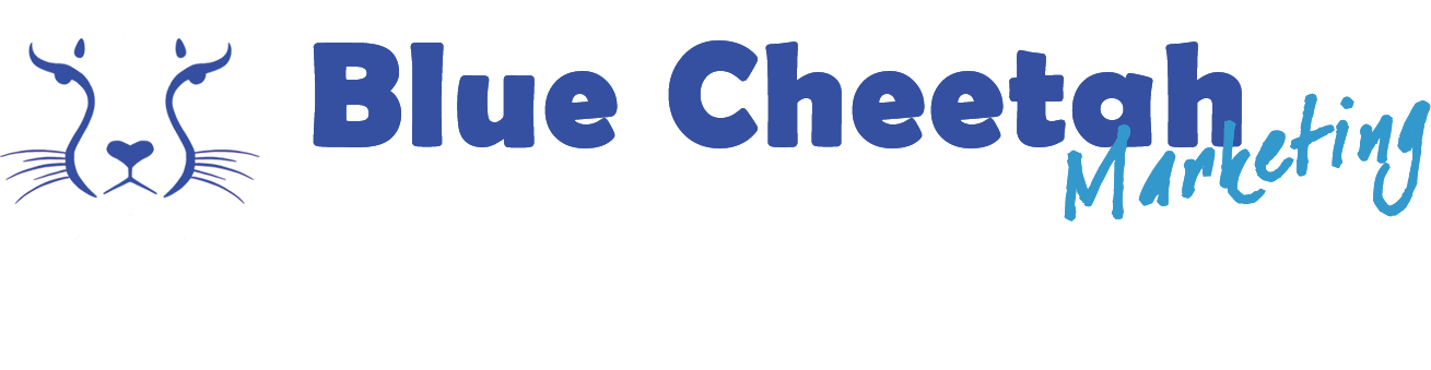
This is a logo for a marketing company that helps those in heart-centered businesses, i.e. healers, massage therapists, acupuncturists, etc. I had an idea in mind, but found another company that had a logo already very much like what I envisioned and so this is what I ended up creating. Not sure if I like it. Not sure if it looks professional.
A lot of people have given positive feedback, but I don't know if they are being honest or just being nice because they like me. I'm an artist, but not necessarily a graphic artist. I've dabbled with graphic arts, but am definitely not professional trained to create logos.
Logos, I found, are difficult to design, as they have to be versatile to be used in many different media and sizes. Anywho, I was hoping to get some true constructive criticism before I finish the site redesign and start promoting. I'm leaning towards scrapping it and just getting someone else to create one for me, not that I can afford that, but...
Thank you!
P.S. I am the client and designer. I'm doing the work for myself.
I'm not experienced with designing logos, but I'm a single mother trying to build a business to support myself, my children and grandchildren. I like doing things myself, if I can. :D
Thanks.
9 Comments
Avoid using angled text on top of text. Also avoid mixing typeface styles.
Secondly, can you add a bit more detail to make the cheetah more distinquished? I know by the black curved markings it's a cheetah, but perhaps it could use spots as well? Don't overdo it, but just enough to give it that extra flavor.
A good start, but let's push it even further.
Yeah, I'm not too satisfied with the text myself. Just wasn't finding anything that I "felt".
The first cheetah image I sketched out had much more detail, but I felt I wanted something simpler.
Perhaps I'll tinker with it a bit more.
Thanks!
Sorry, but your cheetah is looking a little bit... uh... er...
...
*starts blushing*
...
It looks a lot like a woman's legs and private parts!
Sexy marketing works. ;-)
I'm looking, and I'm still not seeing it.
Thanks. Your comment makes me giggle. What we see in the world is truly a reflection of our mindset. I'm a celibate woman, so no where do I see anything like that, but I have experienced with one painting I did one day, a man pointed out to me what he thought was an intentional hidden penis. LOL!
Too funny. I don't see it, but who knows, if you do, others may too. haha
Upon closer inspection, it does look more like a bum. :) A lady from behind, even the eye lines look like arms to me now. The lines in the nose just have it goin' on!
*rawr!*
I think you have a great start, especially given your logo design experience and, even more, that you're designing this for yourself. Always the hardest. Though there are some suggestions above about tweaking the symbol, I think you did a great job with it so far. I would definitely work of the font selection. The main font isn't terrible as it has that Africa Serengeti style to it but the subtext definitely doesn't work. Straighten it up, justify it to the right of Cheetah and maybe try using a more straight forward sans-serif font. Good luck to you.
Thank you everyone for your input! I truly appreciate it. I keep feeling like it's missing something. I wasn't completely satisfied, but I think with your suggestions, I'll keep tweaking a bit and hopefully get to something that looks right.
I truly appreciate each of you taking the time to respond. Too many people are just so quick to tell me it looks great, but that leaves me feeling like they are just being nice. It's refreshing to get real constructive criticism!
Thanks a bunch!