Brief from client
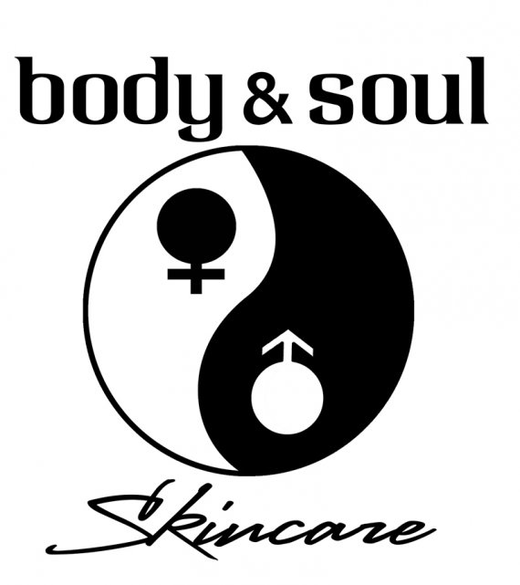
client wanted a black and white logo that was not too feminine for use on a line of unisex skin care, possibly a yin/yang symbol. The font could be neither too masculine or too feminine.

I ended up with a yin/yang coupled with the male/female symbol, and a letterhead font
