Break Through
Brief from client
Name to incorporate in the logo
BreakThrough
Description of the organization and its target audience
its a sport brand, targeting hardcore athletic people.
Industry
Sport
I'd like to explore the following colors:
Blues: Knowledge, trust, calm and honesty.
Dark neutrals: Formality, mystery, exclusivity and luxury.
Light neutrals: Purity, balance and sophistication.
Literal, Modern, Masculine, Mature
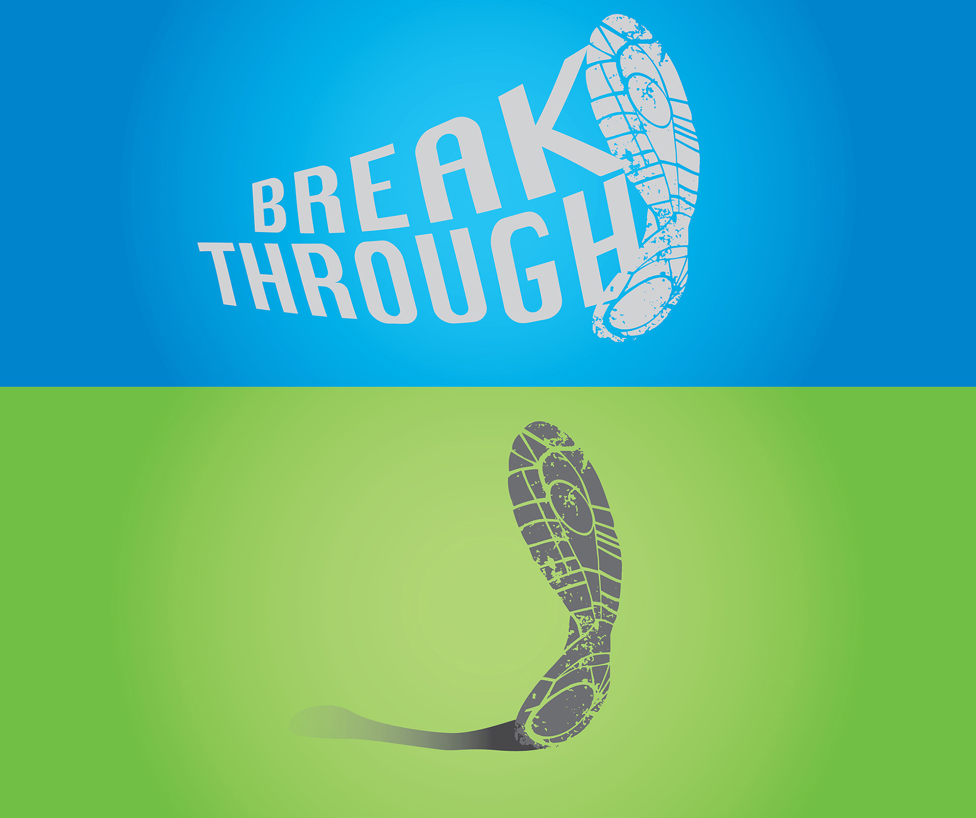
The icon is the soul of an athletic shoe energetically bending forward. This suggests movement or an aggressive kick. I like to think of this logo as kicking down a door or breaking through a wall (without the cliche cracks or broken stone pieces). Wanting it to be simple, clean, and read well on various color backdrops keeping the logo in grayscale. Going for very modern and fitness oriented without a lot of clutter.
1 Comments
This one isn't working for me at all, unfortunately.
Nothing looks simple here. The sole is made out of lots of tiny pieces and scratches. Being deformed on top of that, it makes for a pretty complicated symbol which is hard to identify in a small version.
The font looks really dated (as in the default one on Macintosh from the 80's =) And same as the symbol, the warping isn't really working. The feeling of movement isn't really showing. I'd go for hand-lettered word mark here.
I'm not sure what's going on with the logo on the green background. If it's a shadow, it looks rushed and poorly made.
Good luck!