Brendan Lloyd Personal Work
BrendanLloydDesign | Thu, 05/29/2014 - 19:03
Brief from client
Simple, clean, professional.
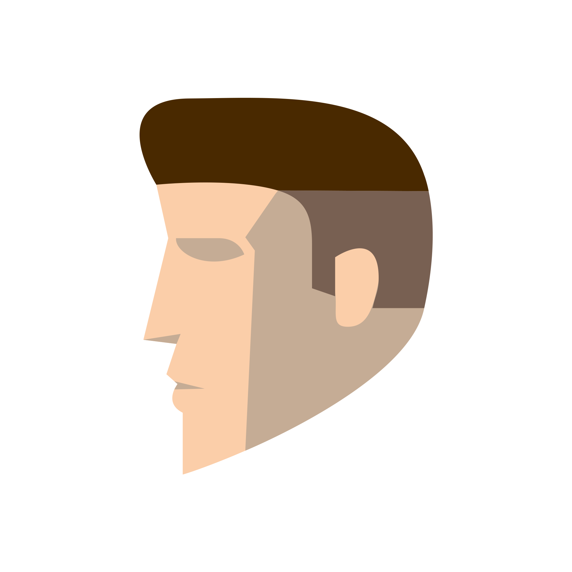
After critique and many revisions I decided to take on the minimal approach. The icon is supposed to resemble myself in simple shapes, for a personal brand.
11 Comments
Decided to ditch the nose shadow.
i gave thumbs up for typo but you have no typo so please ignore me after few beers. I am enthusiast about the progress of your work. good job here! and i would keep the shadow of the nose, you can clean such details when you know you print on very small things as pens or lighters, otherwise you can keep them.
Thanks man! I'm always looking to improve, and I hope that it's noticeable that I take all critique into consideration. That's also a good point about small printing. I'm not exactly sure what type to use yet. Although I enjoy the badge on its own.
i have no idea what type, something solid, i would go with all caps but i would experiment between rounder shapes and more squared something. Usually when i have something like this i try fonts until i am satisfied. Also you might take in consideration the possibility to trow in a wonderfully caligraphic handworked typeface.
This one is much nicer, but I feel it loses a bit of personality.
Especially in the eye. The last one had a definite anger emotion behind it, this one looks a little more... sad and unfeeling.
I think that just tilting the eye shadow a little would make this much more expressive.
I really like that you went for a flat design type of thing.
But I can't help but think that it's too pointy. Maybe you could try to lower the right part the headn and maybe add a little dent so the whole head would also be a the B from Brendan. Just an idea.
Keep it up.
Like this? That's kind of a clever subliminal.
Here's a set after some more critique, I tried to make the features more rounded but I don't think I'm feeling it just yet. Still needs a lot more experimentation.. I feel like I keep making the head fatter in order to make the back of it a B shape, I don't think I'm doing Shawali's suggestion justice lol. Still leaning on #4. Tilted the eye for the angry expression, and brought up the nose more to give it a little more space for shadow.
three of four but i like more the lips and the chin in the 4th.
I made much better rounded corners this time around, and put the small subliminal B in the back of the head. It's subtle, but I like it since it adds the B, and it's shaped like the pompadour haircut. I also rounded the shadow on one version to see what that would look like, and tilted the eye for a more aggressive expression like the previous versions. Let me know what you guys think
one or four