Bright Ideas Construction
bkaul01 | Mon, 09/21/2015 - 18:29
Brief from client
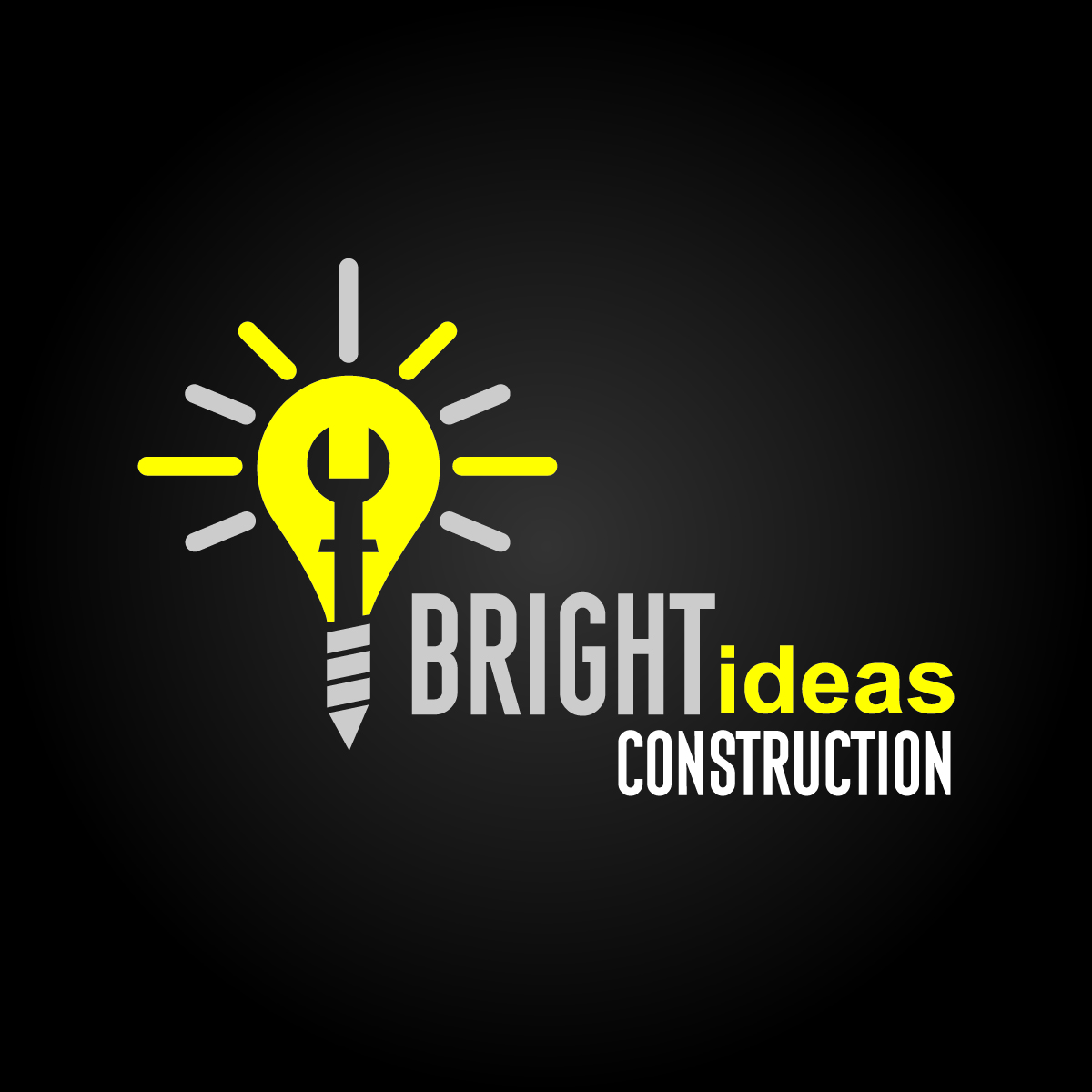
Free will on this design. Logo concept for a new company called Bright Ideas Construction. Wanted to incorporate the construction aspect, so I did so with the negative spaces.
I'm not sure if I'm quite sold on the the overall text layout yet, but it is just a start.
6 Comments
There are good and bad things here.
The bad: when one wants to illustrate the concept of "idea", the first thought that comes to mind is a light bulb. Hence the gazillions of logos with a light bulb. It's just not creative anymore unless you make it look totally unique and awesome, which is not the case here unfortunately. You tried to cram too many elements in there, the wrench, the nail and the screw. It feels forced and make the whole thing too complicated.
Another thing that doesn't really work for me is the composition, and more specifically the text layout, which as you thought isn't really optimum and also complicate things. For a contruction business, I would expect something tighter in ter of placement.
The good: the colors. This combination fits pretty well with that type of business. Now, you got to make sure that it also works on a white background, since it's what your logo will be more than likely seen the most on. Maybe I'd get rid of the grey and keep the yellow and white.
Lastely, I dig these fonts. Knockout and Helvetica, if I'm not mistaken. They compliment each other pretty well.
Globally, this isn't really working. With that name, I guess it'll be difficult to veer off the light bulb thing, but at least try to simplify it to the core minimum and make it look different than the billions other light bub logos out there.
Keep it up!
It does not only say ideas though, it also says bright; If anything it is the most perfect symbol for this one because it has two descriptive elements about it in one symbol.
I am confused as to why you say it is the perfect symbol, but gave a thumbs down on the symbol? Just wondering.
If you were to take a second; read my whole critique you will see at the end I actually say why.
Thumbs down for attentiveness.
Typography is ghastly and needs some serious rethinking.
But you know that.
As for the symbol... I agree it is a little busy and might have to much going on with it.
I don't think the light beams are necessary, a yellow light bulb already gives off the illusion as being bright.
The filament you have decided to portray with a wrench is working, just maybe try an shrink it down a little bit and give it more shape(maybe try just the outline; ya know like a filament wire), change the shape some how, the cuff on the shaft of the wrench makes no sense either.
I like the screw as the base just shorten it up some, the point and the fact it is a construction company automatically will allow people to identify it as a screw or nail, either one works.
Rework that typography!
Post the successor, good job.
*I am giving a thumbs down on the symbol purely on the fact that I think it needs some touch ups
I agree with shrinking down the negative space within the bulb definitely and also to shorten up the screw portion.
I may just come up with another light bulb all together. Thanks for the constructive criticism!