Bugbyte Computers
Snootybeef | Sat, 03/23/2013 - 02:01
Brief from client
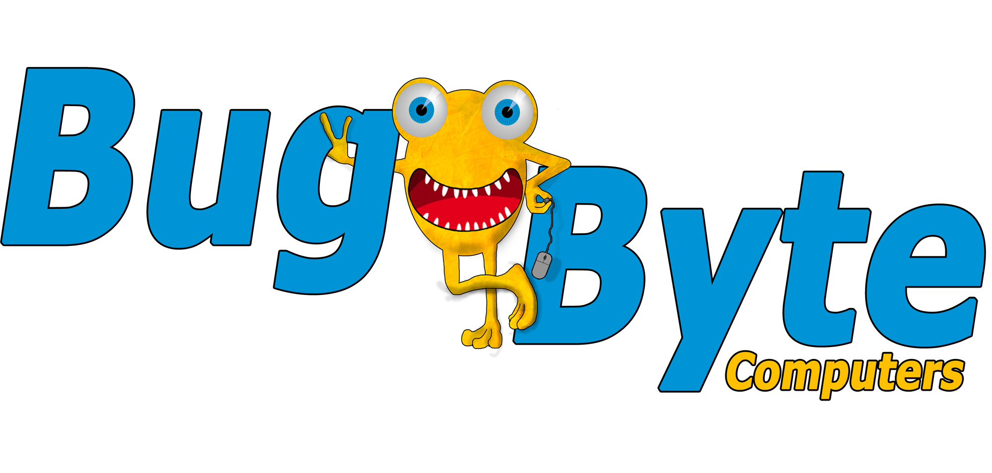
Design for our online computer company. Idea we were going for is to create a serious business with a fun and approachable feel to it.
I had a look around the site and found some inspiration and though I could possibly get some guidance.
Went for a more solid font but not sold on it completely to represent a more professional image combined with the mascot for the fun and approachable side but not sure if it comes across.
I am by no means a graphic designer but we are a start-up so you get used to doing just about everything yourself :) . Any feedback will be appreciated!


6 Comments
hey i like the funny character and colors make good contrast, but i think the blue typo is just too simple, if it is a computer company maybe you can change the typo to something more technology look like..
and i wonder how the character looks like without its texture..
I am also a beginner and I think you did great job for a beginner. Blue typo with the black outline don't work with the character, perhaps use colours that can blend in.
The 't' in Byte seems too close to the 'y' letter but far away from the 'e'...you don't need so much outline.
Better or not?
hey the font is much better now, and i could suggest you that in a logo you can have 2 different fonts, so maybe you can have bug byte in a font and computers in another font.
Also the word computers i think is too small, i know that it fits perfect on its location, but i just think is too small, try finding another good place for that word.
and there is something i notice on the character, you added some shadows on its knee, feet and arms, but those kinds of shadows are not the best for a logo, try vectorizing the shadows, instead of adding those like a brush with blur, and make sure that the shadows stays in its place, cuz' i can see that the knee shadow is outside the stroke.
Thanks , now that you mention it , it seems glaringly obvious (the shadows). Will play around with "computers" and post when I get a better fit.
Sorry, but from a designer point of view, this logo doesn't work at all.
Globally it looks really dated. The characters as a symbol has too many details the eyes, teeth, the mouse...) and looks a bit too random, but it can be still funny. But I wouldn't use it in the logo, it only complicates thing. Maybe have it as Gecko does with it, well, gecko =)
These fonts looked modern and computer-y in the 70's maybe. Design is 90% and these ones are the reason this logo look really old. Same goes with the colors.
I understand you're not a graphic designer and you did something not too bad for someone who's dabbling in design for the time. But this is the main reasons your logo doesn't work.
Good luck!