Brands of the World is the largest free library of downloadable vector logos, and a logo critique community. Search and download vector logos in AI, EPS, PDF, SVG, and CDR formats. If you have a logo that is not yet present in the library, we urge you to upload it. Thank you for your participation.
Version history
Version 1

- I
- S
- T
- C


4 Comments
Ouch, my eyes!
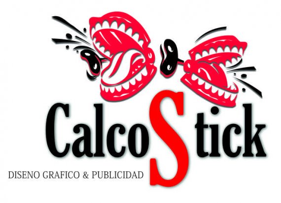
Sorry, but this is really not good. The symbol is way too complicated with too many details.
The drop shadow is major don't. It complicates things even further and looks really bad and unprofessional.
The subtext is badly placed and overall, the composition is all over the place.
Why the big red S? Why the these mouth clapping thingies?
Totally agree with shawali,
very hard on the eyes, i would loose the shadows, change the font and again why the big S?
Let me put my sun glasses. To much noise. Start all over again
Like Shawali but I've to had that it's make the brand un serious. It looks like a funny toys brand.