Captain Pi
SmokOndri | Sun, 01/17/2016 - 23:46
Brief from client
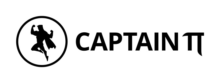
Logo for an e-learning / broadcasting site in mathematics field. The target audience are high school students and below. The title is the nickname of the broadcaster - Captain Pi << Pi as a greek letter >>.
Logo had to be in a horizontal orientation.
The biggest concern in regard to the first version is whether the Pi letter is recognizable and not blending with the previous letter.
With limited resources at our disposal we seek your advice in choosing the best version of this logo. Thank you!
6 Comments
The inverted version of the logo as will be seen the most.
Did create the super hero silhouette yourself?
No, it was bought separately. The real differences between those versions are in typography which the client implied on changing to v2 or v3.
That's your biggest problem right there. I asked you but I was pretty sure you picked it off some vector bank.
Never ever do that when you create a logo. It's just cheating. Even if you bought it fair and square, the one thing that looks best in your logo, you just didn't do it yourself. Moreover, there's a clear discrepancy graphically speaking between the symbol and the rest.
That being said, this version is better than the others. But you really need to come up with your own symbol.
I am fully aware of what you're saying. I didn't want to cheat though.. pardon me for not clarifying that first, what I needed was rating of typography. Please treat this as a temporary solution.
Thank you very much for your rating.
Typgography-wise, this one is the best. But really, you should create your own symbol for a logo. It should be unique, not something anyone has access to.