Carnivora
yanaokrent | Thu, 09/20/2012 - 16:55
Brief from client
This is a new company for food and accessories for cats only, and the client wanted to let it show in the logo by showing cat's features.
The black color indicate night. Yellow & green is cat's eye when he's calm and angry. Sharp edges is teeth, and the logo look's like it was torn apart by a carnivore.
The angle was made to show cat's movement twords up, when he jump.
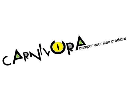
Food & Accessories for cats only
7 Comments
This is a fun idea, I get the cat eye idea and the... well, I get the cat eye idea. But (and I'm sorry to say it) I don't think this works at all.
The text is really hard to read (I never look at the company name before looking at the logo, and I see "carnnorva or carnvora" before figuring out that it's supposed to be carnivora), the thin stroke around the cat eye (within the O) doesn't need to be there, I'm not sure why there's a gap at the top of the O (unless it's supposed to be carnivura?), the subtext is really small, I don't know why the I looks like there's part of a white box over it, I don't get why the A's are filled in with green, and lastly- I'm not sure that having it at an angle is necessary - I don't think it needs to be and I don't really think it conveys a cat jumping. (But it's a good thought!)
I'd maybe start over with a new idea- but I DO like the font that you chose, and I think having a cat eye somewhere in it is a good idea!! Maybe whiskers too? I dunno, but let ideas flow in and see what you come up with!
Hi. Thanks for critique.
The letters are shreded to pieces, because cat is a carnivore, preditor.
I didn't want to make it another soft logo, because it's cats.
The idea is great but you can't stuff so many things in a logo. Pick one and you'll win the game. The eye is the most obvious one to go with, focus on that. The angle is something I'd never figure out and you can't sacrifice the general usability of the whole logo for that. I'd rather try to imitate a typical form of a cat with the upper shape of the letters, but better forget all that stuff and stick to the eye.
agree with sara.
I wouldn't think of a cat if I saw this logo, at first glance I thought it was a carnival, or some kind of hectic event.
The angle feels like it is a desperate attempt to add dynamic movement into the concept, and the slogan makes it too long of a line, so it throws the composition out of balance. The letters are already dynamic, having them at different heights and with the sharp angles; I agree with Sara it doesn't need to be slanted. I would also bring in the slogan under the "carnivora" so that it is not so long.
Do you think you could close the O and incorporate cat ears on it?, it seems to me that was the idea but the ears are not obvious enough and like Sara wrote it looks like a U.
Cats make really cool curve lines that combine with their pointy ears. Maybe try to incorporate the curves?
I think the cat's eye should be the main and probably your only focus for this logo. It's obvious with the name of this company that there isn't much of a FUN element to these cats..... so why not try a cat's eye sitting on a black background? When I think of a carnivore or predator.... I think of jurassic park or eyes looking out from amongst the bush in a forest... ready to pounce and attack. There are so many ideas here that could compliment Carnivora or Predator.... what you have done shows none of that. Centre in on 1 or 2 cat features and go with that!
Thank you all