Carrapeta
Lucas artes | Fri, 01/27/2012 - 19:21
Brief from client
Carrapeta é o apelido do cliente na modalidade wheelign (Manobras de Moto), foi pedido para utilizar cores vermelho e preto, e um estílo radical próprio do seguimento.
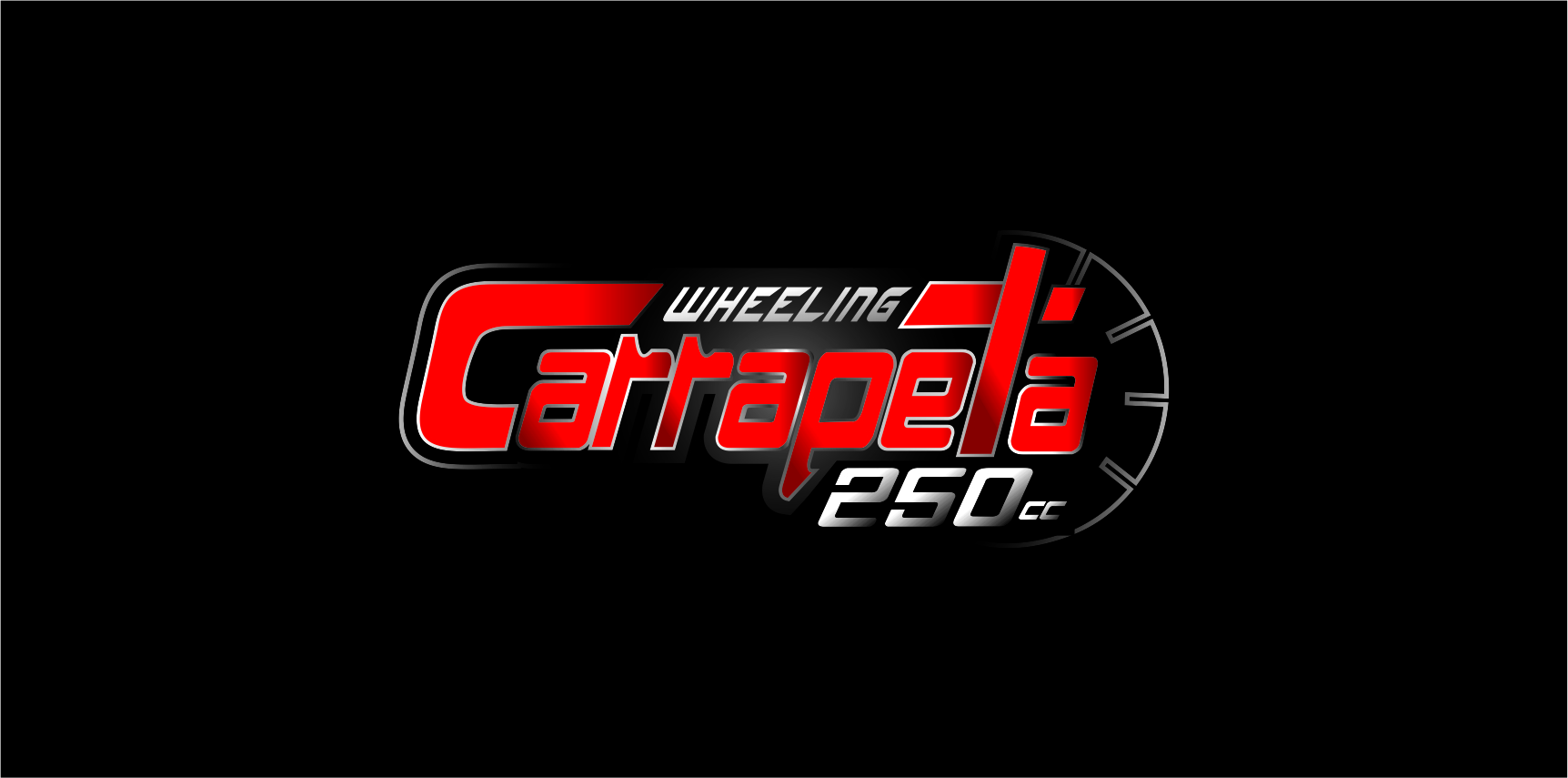
Logo para aplicação em mídias digitais,
"por isso os degrades e efeitos"
5 Comments
I can barely read "Carrapato" let alone "WHEELING".
Start over but this time try something readable. Tip: lose the gradients and find better fonts
How about you kill Photoshop, start Illustrator and try to act like a person who knows what he is doing?
nothing is working here.
The gradients and strokes do nothing for this piece whatsoever.
you real need to be thinking of what you want to portray. Do some sketches and come up with a better concept. Then execute it
I think you should look into some identity solutions ensuring creativity, trademark risk awareness, regulatory insight and resonant design execution.
Hope THAT helps.
Come base lavora in vettoriale, schizza su un foglio degli elementi, poi cerca un font leggibile, aggiungi l'elemento più convincente (relativo al tema) che hai disegnato e in seguito colora in bianco e nero. Quando hai raggiunto un effetto che ti piace ce lo mostri e vediamo se ci piace. Buon Lavoro.
As a basis vector works, sketches on a sheet of elements, then look for a readable font, add the most convincing (relative to the theme) that you drew and then colored in black and white. When you have achieved an effect that you like him to show and see if we like. Good Job.