Centro Gráfico y Papelero
CGYP | Wed, 03/05/2014 - 18:00
Brief from client
We need your help in the selection of the logo for a graphic and copying center which aims to provide graphic services and quick marketing solutions for students, architects and people working in the area of graphic innovation. We would love to hear your opinion in the selection of one of these two logos,
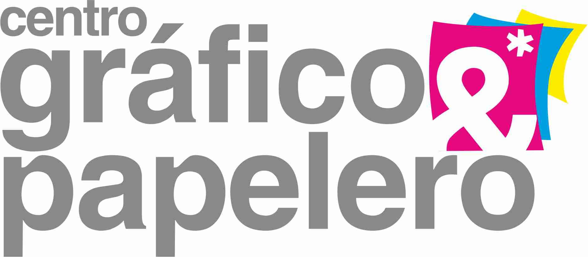
A simple but very modern proposal, based on grey tone typography and that denotes confidence. It is accompanied by sheets in CMY tones that aim to emphasize on the services that will be provided.
5 Comments
Me gusta el diseño
Well "Me gusta" nothing, the CMYK idea is sucked-out and there and the type isn't quite balanced compared to the symbol
I'm with webhunter on this one. This is pretty unimaginative, certainly not modern (whatever "modern" is supposed to mean) and overly complicated.
And what's up with the P? The C looks weird too.
Scrap this one and restart fresh, not before having had a lot of inspiration and having sketched a few dozen ideas, if not more, before using your computer.
Mmm, sorry but the other 2 above are right, your logo is fresh and clean, but is so generic. we need more styles, not just stay in the cmyk side.
Your company have a very long name, and need play with the font sizes and kernels, Use more styles and fonts, and go away from the cmyk type.
Sorry for my bad english and Good Luck
Y si... aplicaran la ley de tercios? se salieran del todo de la idea del cmyk, por ejemplo full balck y un detalle en un color? Ajusten el kernel y a ver qué sale.