Ciaran
ccrudden | Thu, 11/05/2015 - 12:33
Brief from client
Create a brand for a sports company called Bigfoot.

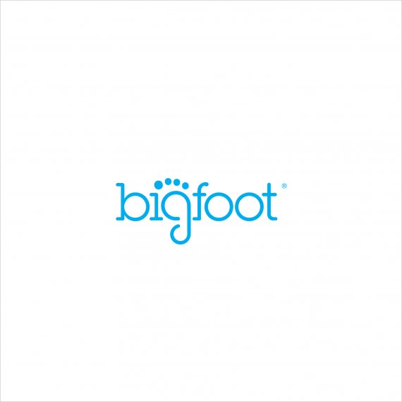
This logo was my submission for a test brief commissioned by my current employer. The brief was pretty open, so this was my submission, along with an extensive branding package.
My thinking was that with a name like 'Bigfoot' there are some very obvious routes to go down - an earthy, grungy look is one but I wanted to go against the grain a little and portray a modern thinking brand that is a little more original and universally appealing.
I ended up being successful and landed the job, but I'd love to get some feedback from you guys as I'm a frequent visiter to this site, but I rarely post anything. I thought it's about time I actually contribute.


6 Comments
I looked at some examples of logos with the name big foot and they all used the footprint. Of those this is by far the best version of those logos. Good job!
I can't really think of any way to improve it other than to mention to watch out for the kerning between G and F and O since they all look tighter together than the other letters but thats a very very very small gripe.
Good job!
A quick google search for "bigfoot logo" will show several logos with the same idea. So, unfortunately, the idea isn't really original.
That being said, I quite like this logo, it comes off pretty neat and simple, just how I like it. My main beef is that the big toe isn't directly on top of the i, which makes the symbol a bit off balance.
Nice work of the font.
Thanks for the feedback. I agree there are plenty of logos out there with a foot shape integrated into the type, but I felt on the most part the executions were predictable and outdated looking. I felt the idea of using the g/i in this way was unique. The big toe - that was a compromise on my part, directly over the 'i' made the toe look a little disconnected from the foot - but yes, looking back this is probably the one thing that sticks out to me too.
Im liking this quite a lot but agree with the other comments above. One way to combat the big toe becoming the dot for the i would be to tilt the whole "g" slash foot to the left slightly so that it can sit properly to make the dot for the "i" i think it would look more natural with the "g" rotated slightly as represents a footprint better than being straight up.
Nice work!
I like it! Try other colors, red or orange for example. In blue I have association of products for baby aptamil:)
I can see that is not an original idea, but it seems a cool logo compared with other ideas.
I like what you did with the letter "g" is quite attractive.