Class Suites
Katelin Kinney | Tue, 12/22/2015 - 04:08
Brief from client
Mock hotel chain branding. The concept behind this brand and marketing plan is that a hotel is the calm pause we look for in between adventures. So the look and feel will be very light and airy.
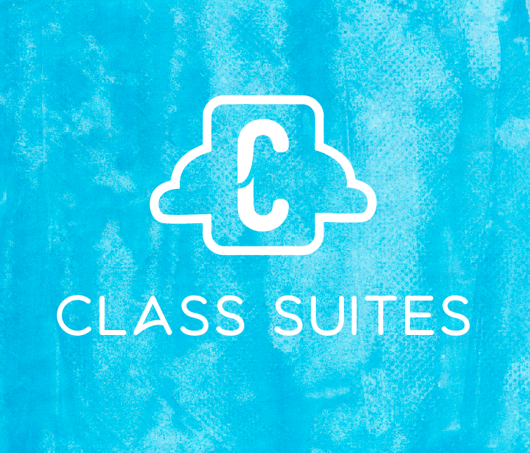
I'm trying to go super simple and minimal with this instead of really ornate and decorative like you may think with the name "Class". However, I'm starting to wonder if this looks too clunky for a concept based around breathing and air...maybe the enclosed rectangle is what's making me feel like it's too heavy. Or maybe this is reading too "mobile app" and doesn't translate well into the hotel/resort market. Any thoughts?
6 Comments
Maybe something left a little more open and slightly organic would fit the theme better? This is rather rough, I'd need to tweak the cloud more, but just giving a general idea here.
Another option which gets away from the monogram since the C wasn't going well with the font. I know I'm posting a lot on this one string, sorry! :\
I think the first one is the most cohesive, #2 symbol is not very harmonious or comforting with the random cloud squiggle things and #3 the big blank door is not welcoming. Your font choice seems a little dated to me. I understand what you are aiming for with the understated class angle, but I would still stick to an understated, timeless classic font, like maybe futura book or century gothic.
Great points. I'll work on the font later tonight (I'm new to typography so out of curiosity when you say dated about how old does that font look? early 2000's?)
Would it help if the door wasn't solid, or maybe if it was an open door? I'm just feeling hesitant on the enclosed C because it has started to feel....kind of suffocating or constricting to me.
Yeah I'd say that's the feel I get from this font, early 2000's.
Good solutions for the door, but I'm still not a fan. To me the first one still feels the most comforting, I like the cloud/bed look.
If the enclosed C feels constricting to you trust your instincts and explore more open designs. This might be a good exercise to discover good design's two edges. Finding your style and building on it, and pushing yourself to work where you aren't comfortable.
I am a fan of the door. It just tells me more than the 'C'.
The solid door is a bit standoffish though, the open on, or the outline one are better in my opinion.