Claudia Navarro
ManyaPeru | Thu, 07/18/2013 - 22:26
Brief from client
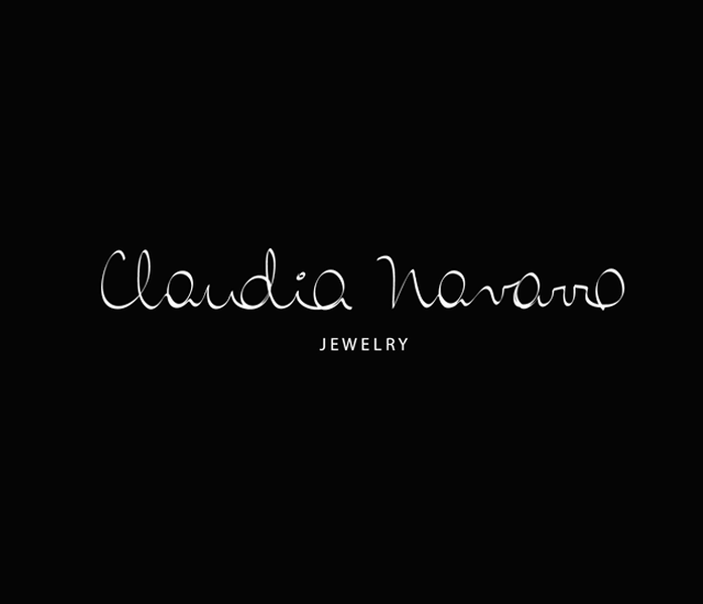
Claudia Navarro is a silver jewelry designer. Claudia likes to reflect her personality in all its works and its logo would be no exception.
Manya.pe team designed the logo inspired by the peculiar form of writing of Claudia, she writes from the bottom up. The logo reflects an elegant and very thin, like Claudia jewelry.


4 Comments
Love the simplicity. Don't like the font. It looks a little hard to read.
Like the font on 'Jewelry'. Its very classic looking all together.
The font was inspired by the calligraphy of the customer, the letters are designed from the bottom up. Thank for you comments.
I like this logo, and the font too. But I agree with MDCasino, it's a bit too light. I would slightly beef it up, to give it more weight.
Not very readable right now, especially in the thumbnail version.
Anyway, good work.
I really like it, but you need to make it heavier cause it's too thin, think about the reduction of the logo. Try and difference more the o from the a, cause that's not a common lastname in english, and make the jewelry bigger.