Brands of the World is the largest free library of downloadable vector logos, and a logo critique community. Search and download vector logos in AI, EPS, PDF, SVG, and CDR formats. If you have a logo that is not yet present in the library, we urge you to upload it. Thank you for your participation.


4 Comments
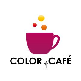
Hmmm... i like the type, but in my opinion dont fit with the symbol... in the other hand, the symbol is to much clean... if I were you I bet in strong colors.
I very much agree with Geracao's comments. This symbol is nice but there is a sharp disconnect with the type. The type might be better if it used soft edges like those of the the coffee cup rather than sharp corners. Is this business geared toward a female demographic? If so the colors are okay. You could go with a monochromatic scheme whereby choose one color and use various shades for the different elements, including the type.
For an crafts company and coffee i feel there could be more fun with the font choice, usually arts / coffee places seem to have a more fun type choice, I do like the logo maybe toss in some other color to pop?
I REALLY like the symbol and I'm not a big fan of gradations and blends, but this works well. Like the others, I'd change the font and see no reason why the "Y" can't be like the rest. I don't think it adds to the design by being in a different typeface