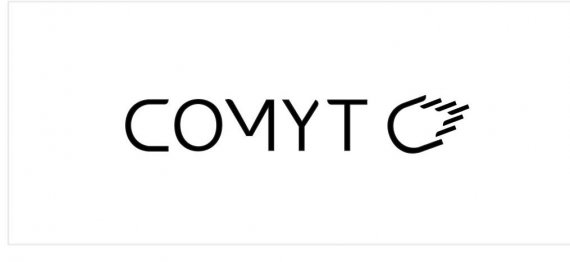
Logo for a new file sharing website. The comet icon should work stand alone, do you notice the "C" in it, any ideas how to make it stand out more? Perhaps that same affect can be done with the C in the word Comyt as well?
Also is the M bothersome that its missing its left leg?
Thank You!

7 Comments
Not bad actually, but is the logo only going to be in black and white? I realize that you may not have picked a color theme yet and want to focus on the logo itself, but color would definitely help pull the elements together, like maybe a medium blue and a lighter blue, with all the text in the medium blue and the "comet" fire being in the lighter blue. The C portion of the comet logo would be in medium blue as a connection to its parent letter in the text.
Or it can be a reddish orange and a lighter orange/yellow color combo, but with either color scheme the colors would work. I believe that comets are usually blue in most space art that depicts them (with asteroids being better for the fiery red color theme.) That and they are heavenly bodies mostly composed of ice.
As with the text, I think the font is good, but I don't think the letters need to be cut off anywhere in the logo.
Thank You for the feedback! I am actually thinking of keeping the colors as black and white. The site is file sharing for creatives , so I'm thinking of muting the branding so that the artwork/files in the site are what stand out. I do like how squarespace.com has gone about doing that.
Is there anything else besides color to help pull the C in the text and C in the icon together? For example, If i put a curl on one end of the C and did the same in the icon they would correlate, but I don't want to do a curl :)
Well to be honest - as a creative - I love the effective use of color. To me, straight black is corporate and business-like and has no "soul." It's very serious in it's demeanor, namely with the strong contrast of a white background.
There are also colors that automatically correlate with their symbols - comets are icy and blue, asteroids are fiery and red, and black holes...are black.
Now I can say that white works on a black background, since comets often look white also and the black can represent space... but it just doesn't jive with the positive black symbol on a white background.
Here is another arrangement of the icon
Just missing color... A gradient would be great, I think. An iccy blue will put the logo calmer than an orangy red.
For the arrangement I think the top ones are better. You can use only the comet for social media or some other use. Don't be affraid to use only the comet for some other piece ( like letterpaper, enveloppe... )
nothing to do with the logo, but I ready it as com-e-tee...three syllables not two. Seeing that little mark didn't make me think it was comet and not com-e-tee. The symbol looks more like a hand to me than a comet. (yes, one with an extra finger)
There's potential with this logo but the symbol going down from right to left gives a very negative feel. If it went up from down right to up left, it would look much more dynamic.
I'm not a fan of the tricked out M. It doesn't bring anything to the plate and fights with the symbol for intention.
I like the black & white treatment.
On a side note, you're supposed to upload only one logo per post. You can post alternative iterations in the comment section. Your post will be edited eventually.