Consisto accounting
Nostragaros | Tue, 09/10/2013 - 23:56
Brief from client
Consisto accounting and auditing company (aka Consisto Achievement)
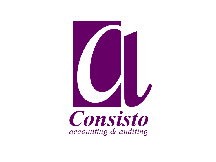
Here is the logo without shadow and gradiend. I changed the symbol too. The color is prefered by the customer.
6 Comments
There you go, much better now, also you got rid of the vertical text which is good. Now I can read a (C) and an (a) but I don't know what they stand for.
Well "C" is for "Consisto" and "A" is for "Achievement" (Consisto Achievement - the alternative name of the firm) or Accounting and Auditing.
Indeed, any logo looks much better without that pitfall that is the drop shadow effect.
Now, I'm really not digging that font. Way to plain and classic. It gives the whole think a 70's look which is not really in that case. Try to find a more modern font, preferably a sans serif.
Not a fan of the all purple thing. Maybe you can find a complementing color and change it all together.
Good luck!
The color was choosen by the customer (I wanted it to be in red).
This is MUCH better but I do agree with Shawali about the font. This is definitely making progress.
Thanks guys! I will search for modern font for the logo.
See you!