Contractor
desiree_mcgillis | Mon, 02/03/2014 - 19:31
Brief from client
Logo for a general contractor just starting his own business( very experienced though)
No real brief except for the "general" part. As in, no specific focus. He does industrial, residential and commercial jobs.
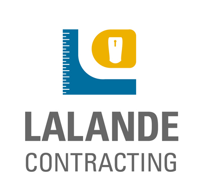
Tried to keep it simple and somewhat abstract. The first thing I'll be using it for is a van wrap so I wanted to make it easier on myself so I could design a really simple, clean van wrap later.
His first remarks were that it took him a minute to notice the measuring tape and he asked for more "definition...whatever that means.
Should I stick to my simple style and try to convince him or can you suggest a way to make it more representational without being busy and complex?
7 Comments
Please choose one logo, When you go to upload, the site says: Important: Only one logo per image is allowed. Please do not put multiple versions of the logo in one image. Thanks!. Next do not forget!
Thanks! First time submitting- I missed that part.
Ok, you continued to put the logo variations, while only one logo is allowed. But anyway the version of the symbol beside combines best and the idea of the tape measure is a differential, the colors match up but I do not know when the typography and this yellow symbol particularly I do not know what is.
I'm sorry but it's not really a different version of the logo. It's the same logo in a different format to show how it would look if, say, it was used on a bus ad which is horizontal vs. a standing-banner which is vertical.
If I can explain it more - the blue is a "square". A measuring square used in contracting. The yellow is the tape-measure. And I made the text a neutral grey so it would not clash or take away attention from the symbol.
Just a friendly heads up, a moderator will usually modify your post to only show one version.
I like this but I think you can tighten things up a bit. Try making the spacing from your symbol to the text and the space between the text uniform with the negative space in the symbol. Also, check the left and right alignment of "Contracting." The right side is definitely not lined up with the "E" above. Those details will help this look more geometrically sound which works with your subject matter in this case.
Thanks for the heads up and the pointers. I'll be cleaning up the spacing and alignment as suggested. The kerning is bugging me as well.