Craft Beer
edub03 | Thu, 02/18/2016 - 02:54
Brief from client
This is an evolution of an existing mark (character).

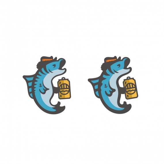
I am tied to (client) certain things such as the fish itself, the tattoo on the fin, and mostly all of the elements included. What I am looking for is feedback on the shape of the fish itself. I'm having trouble with it at small sizes (such as for a site header) due to the complexity. The image shown are 2 of the latest versions, the one on the right being most recent.


7 Comments
Care to post the existing character for comparision?
I don't believe it to be of too much importance. I'd prefer to judge this as a stand alone.
This looks pretty great!
The difference the two are few but the devil is in the details. In that sense I prefer the left one with maybe the fin of the right one and the way the tail end up.
Anyhoo, that's a pretty good job! Althought, I'd like to see the original too =)
This is the original.
Thanks. The reason why I ask is because I like to see the progression of logos, and you were asked to stay true to the original. I think you succeeded.
By the way, I prefer the one on the left as well. The rounded look doesn't appeal to me as much.
Very nicely done!
I also prefer the one on the left. It's the tail mostly. On the right his tail looks a little nubbed off.
I think you did a great job of keeping some of the elements from the original too. Now it looks much more up to date!
The left one look like he had more beer,
the thickness of the lines on the other one remove that effect.