Cremeria Italiana (Italian Ice Cream)
danieleaq | Wed, 02/12/2014 - 01:23
Brief from client
The client wish a new logo for his ice cream factory, his ice cream is exported around all Europe.
Logo must remember Italy but no tricolor or italian flag.
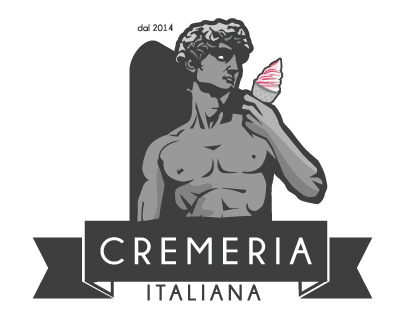
I think about Italy, so Michelangelo's David is a good to remember italian hand/art work. This David is eating an ice cream.
5 Comments
I love it.
Its not really right for a logo though, great digital art work. But a logo really should be much much more simple. :)
Look who's talking =)
I agree with Joe, this is really good looking but a bit too complicated right now.
I would simplify the symbol by removing that black shape in the back and a few details on the statue.
I'm also not really feeling how the subtext is a bit stuck near the ribbon. I would loosen it up a bit and maybe find a complimenting font.
Anyway, good job.
lol this is pretty cool i love how he has an ice cream cone!
Now i want one :'(